
A bilingual logo for a cryptocurrency startup: a horseshoe, an arrow and a gold coin hidden in the letters.
- Client
- Vira, Virtual Trade Services
- Sector
- Cryptocurrency trading
- Year
- 2020
- Role
- Sole designer, concept to final artwork
- Status
- Delivered and used
- Deliverables
- Brand Visual Identity • Brand Book • Corporate Stationery Set
- Tools
- Adobe Illustrator · Adobe Photoshop
The brief
Simple, with something to find.
Vira was a cryptocurrency startup offering virtual trade services. It asked for a logo that was simple yet meaningful: quick to read on a screen or a wall, with an idea underneath for anyone who looks twice. And the name had to work in two alphabets, Persian and English.
The idea
A horseshoe, an arrow and a coin.
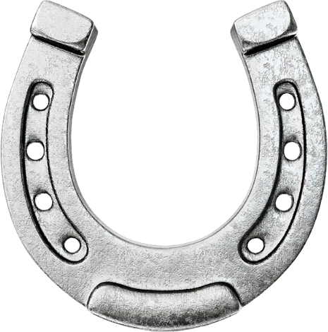
Horseshoe · luck

Arrow · the hunt

Coin · the market
A horseshoe is a classic sign of luck. An arrow is about the hunt: taking aim and going after something. Together they make the idea behind the logo, hunting luck, a fitting thought for a business where traders go after their chances instead of waiting for them.
The coin places the brand in its market: gold and round, the shape most people picture when they hear the word crypto.
Not waiting for luck. Hunting it.
The concept behind the logo · a horseshoe for luck, an arrow for the hunt
The letters
No symbol beside the name. The name is the symbol.
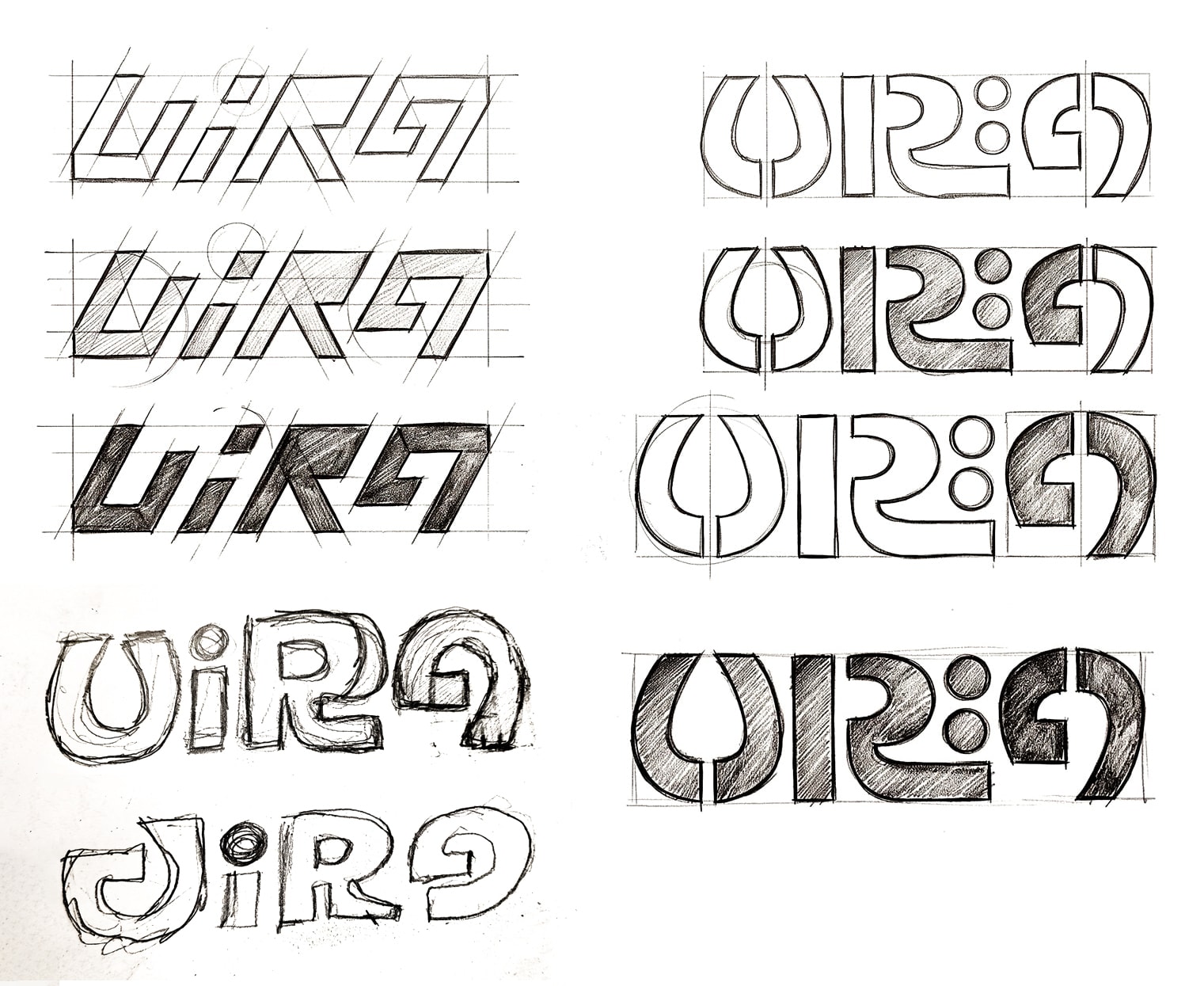
The letters were worked out on paper in two directions: sharp italics leaning forward on a slanted grid, and rounder letters built on a square one. The round letters had room for the concept, and they became the logo.
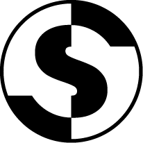
- The V is a horseshoe, open at the top: a classic sign of luck.
- An arrow is cut through its middle, pointing up: the hunt.
- The dot of the i is a gold coin, for the market Vira works in.
- The last letter belongs to two alphabets.
Two alphabets
One shape, read from both sides.
Persian runs right to left, and in Persian the name is ویرا, opening with the letter vaav (و). The last letter of the English logo is drawn to read as both a Latin A and a vaav, so the two logos share one shape. It closes the name in English and opens it in Persian, at the right edge of both.
The coin carries over too. In English it is the dot of the i. In Persian the letter ye (ی) has two dots, so the Persian logo has two coins.
The system
Purple for the name, gold for the coin.
A deep purple carries the letters and gold is saved for the coins. Teal sets the Persian tagline, with coral beside it in support.
Color guide · base, accent and two secondaries
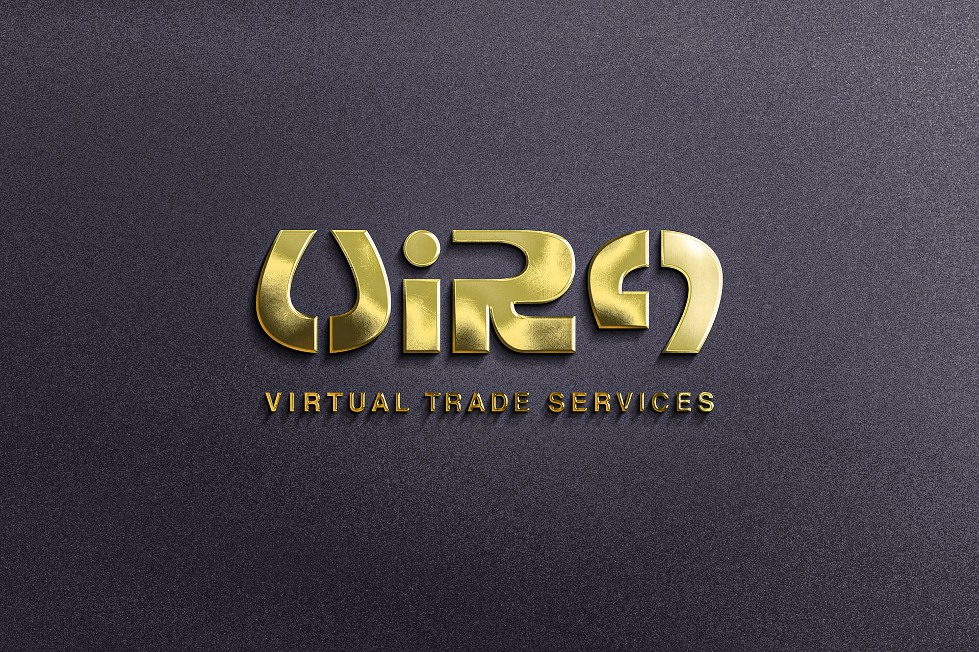
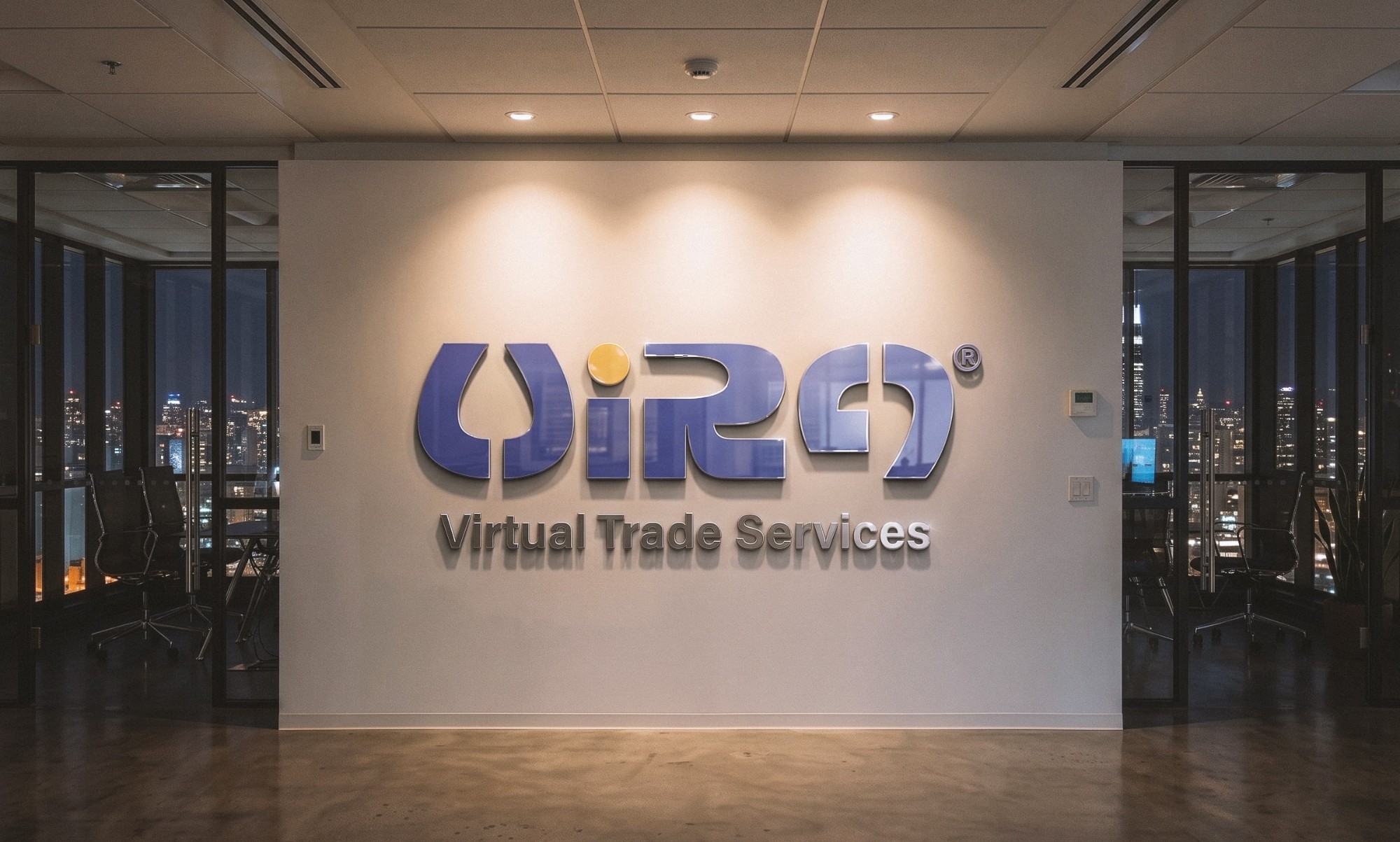
The ideas live in the shapes of the letters rather than in their colors, so they survive in a single color too. The logo comes in black, white and grayscale, and works as polished gold on a wall, as above.
In use
The V holds the idea on its own.
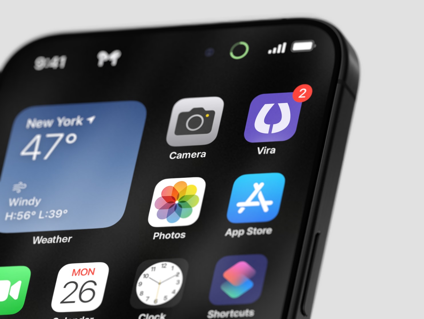
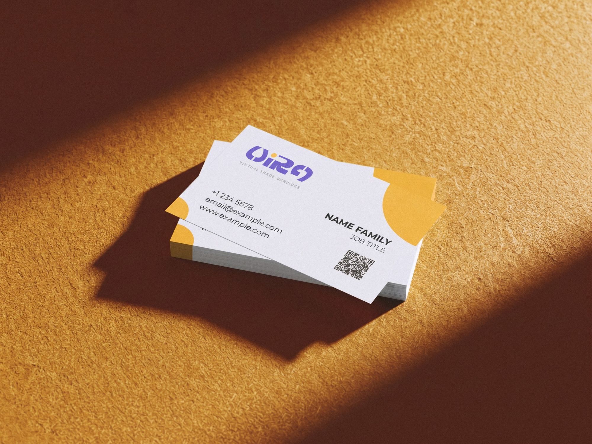
Cut down to its first letter, the logo still carries the horseshoe and the arrow, so the V alone becomes the app icon. On the business cards, gold circles at the corners pick up the coin.
Want a logo people look at twice?
Brand identity, campaigns and motion. Based in Florence, working wherever the brief is.