
An identity for an IoT and cloud provider, built by folding five ideas into a single mark, and drawn so that mark could become the whole system.
- Client
- Smart Innovative Solutions FZE
- Sector
- IoT solutions & cloud services
- Year
- 2018
- Role
- Sole designer, concept to delivery
- Status
- Built & shipped
- Deliverables
- Brand Visual Identity and Brand Book
- Tools
- Adobe Illustrator
The problem
Enterprise IoT and cloud is a category that mostly looks like itself. Abstract swooshes, gradient blues, a node diagram pressed into service as a logo. Smart Innovative Solutions came to me for a new visual identity, and the first job was simply not to draw the thing half the Dubai market had already drawn.
The second was range. Whatever the mark turned out to be, it had to hold at business-card size and at building size, survive a single-color run on the side of a shipping container, and still carry a brand book. A mark that only works as a logo would have failed most of what this company actually needed it for.
The idea
One mark, five readings.
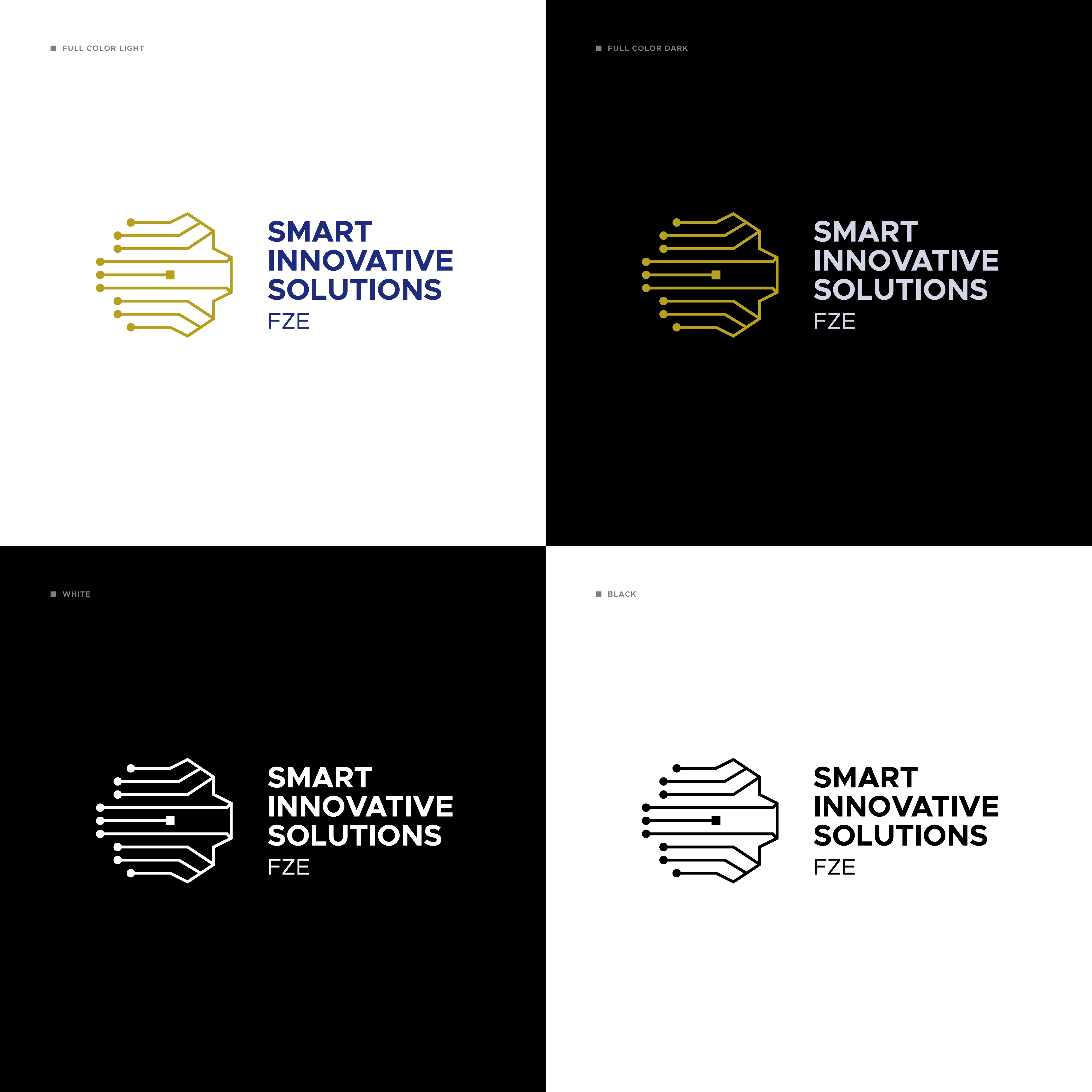
The company sells chipsets, connected devices, cloud and AI. Rather than pick one of those to stand for the rest, the mark holds all of them at once: a processor die at the center, circuit traces fanning out to connected nodes, and an outline that reads as a cloud from one angle, a brain from another, and a flower from a third.
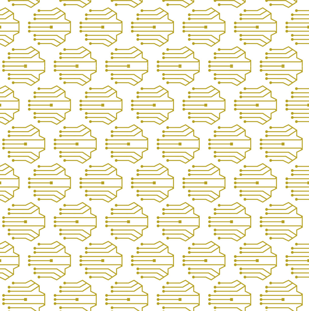
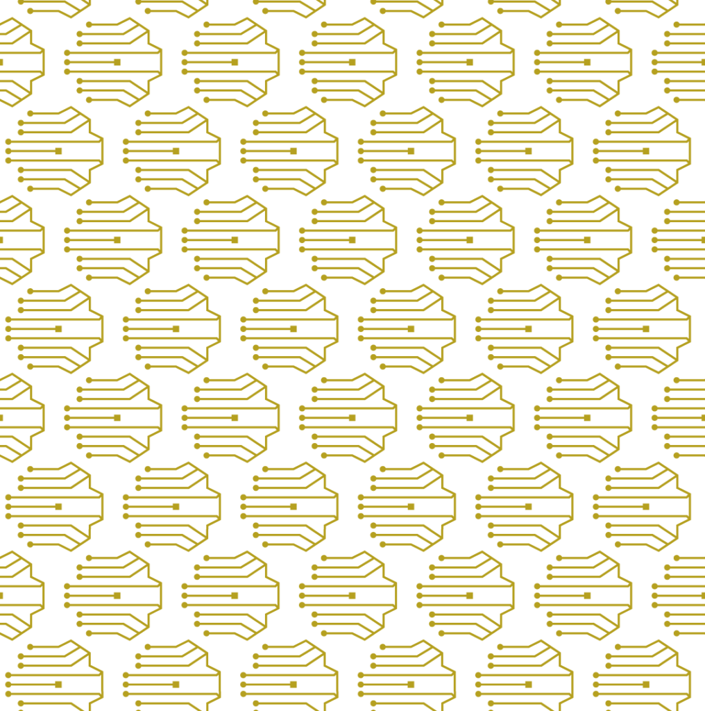
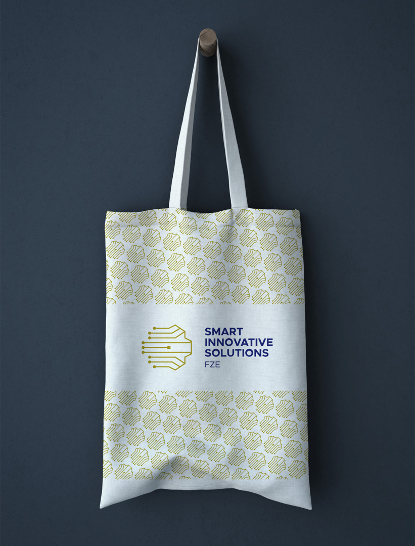
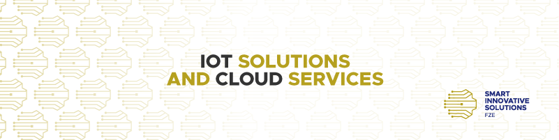
Because it resolved as geometry rather than illustration, it could also stop behaving like a logo. Tiled, it becomes a pattern. That one property is what turned an identity into a system.
How it was drawn
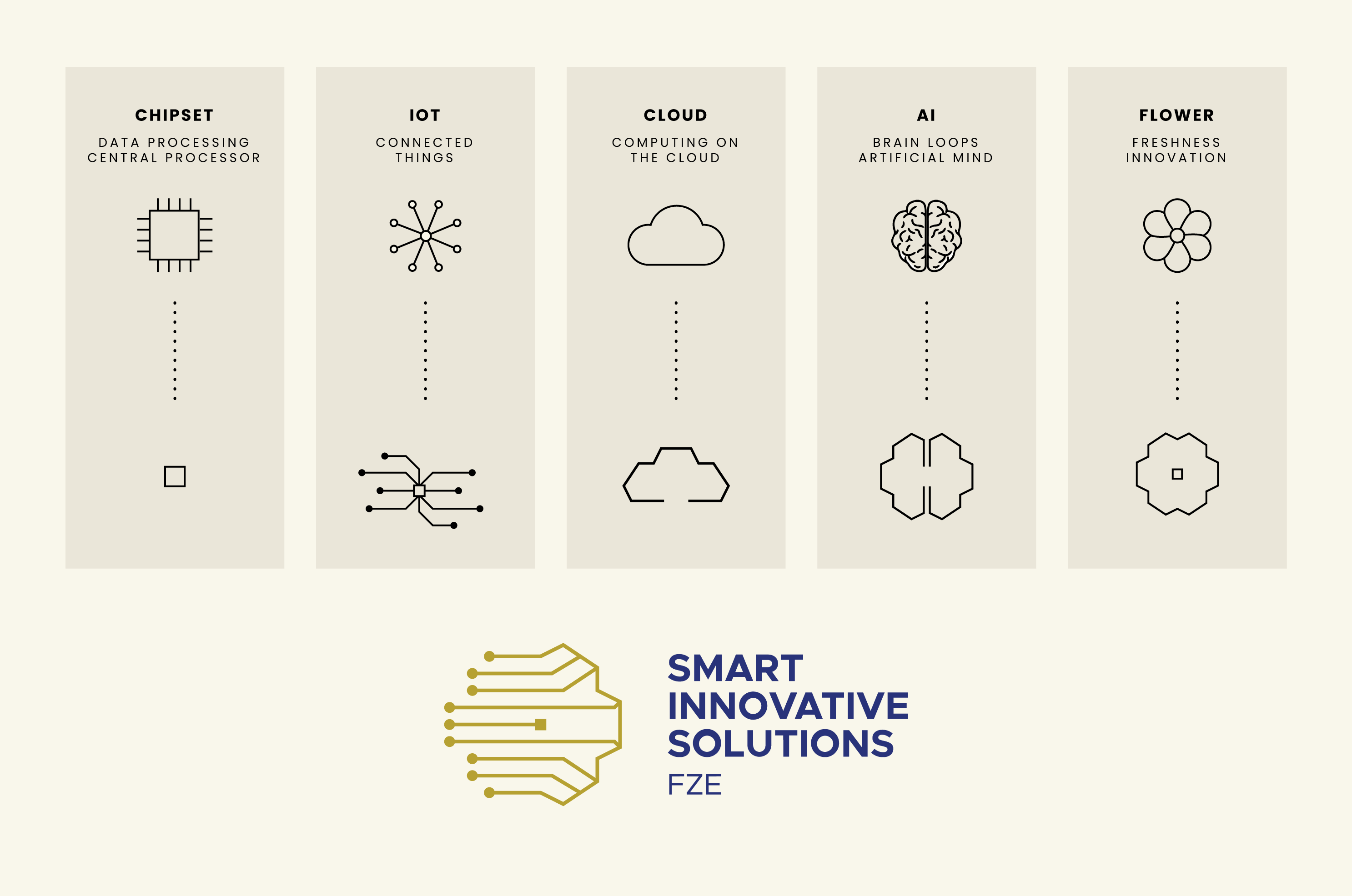
Five starting points were reduced at the same time and on the same grid: a chipset down to a square die, a connected-things diagram to traces and terminal nodes, a cloud to a faceted silhouette, a brain to two mirrored lobes, a flower to eight petals. Same line weight, same corner logic, same dot terminals throughout.
Drawn that way they stop being five references and start converging. The final mark is the point where all five overlap, which is why it reads differently depending on what you already know about the company. The mark carries the gold; the wordmark sits beside it in navy.

There were also other approaches, solely with the S letter and parametric lines: an isometric S built from ribbon planes, a diagonal S in parallel strokes, a rounded S drawn as one continuous cable. All three were competent, and all three were replaceable: change the letter and they would serve any company whose name starts with S. The circuit-trace route was the one that could only belong to this one.
The system
Core palette
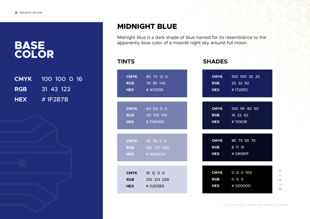
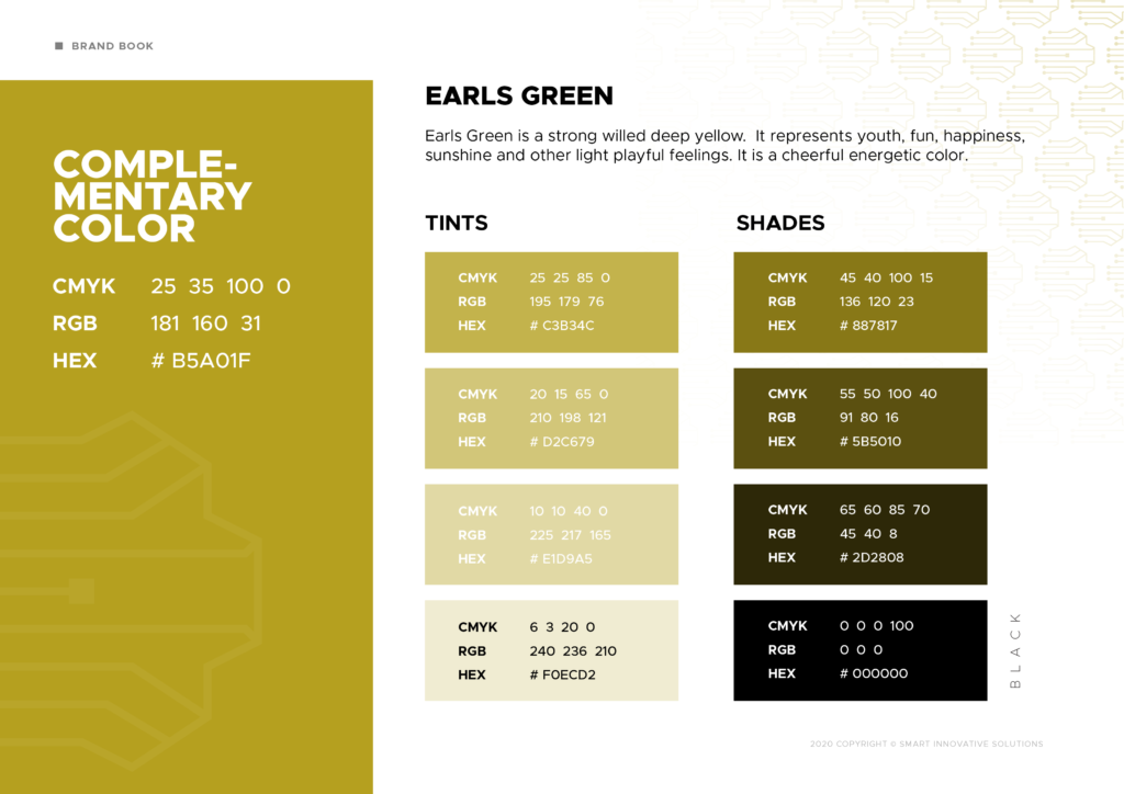
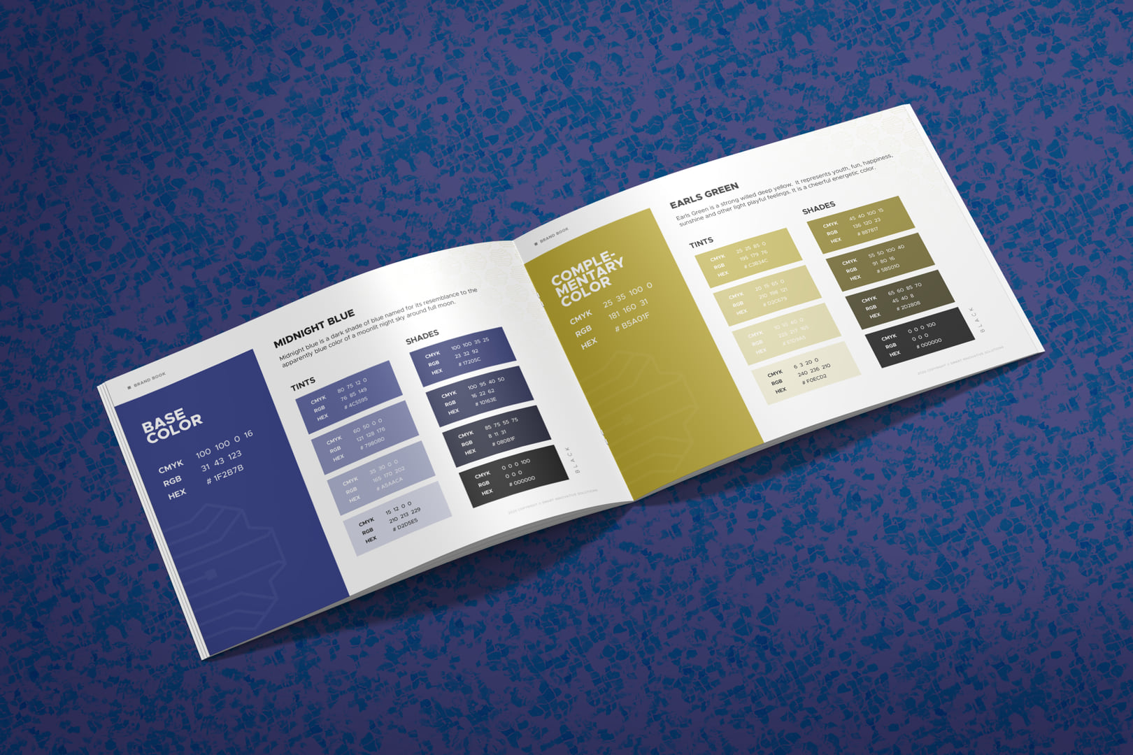
Gold for the mark, navy for the wordmark, held against a warm off-white. The brand book fixes the lockups, the clear space, the single-color behavior and the pattern construction, so the identity survives being handed to a printer, a signmaker or a web developer without me in the room.
In use
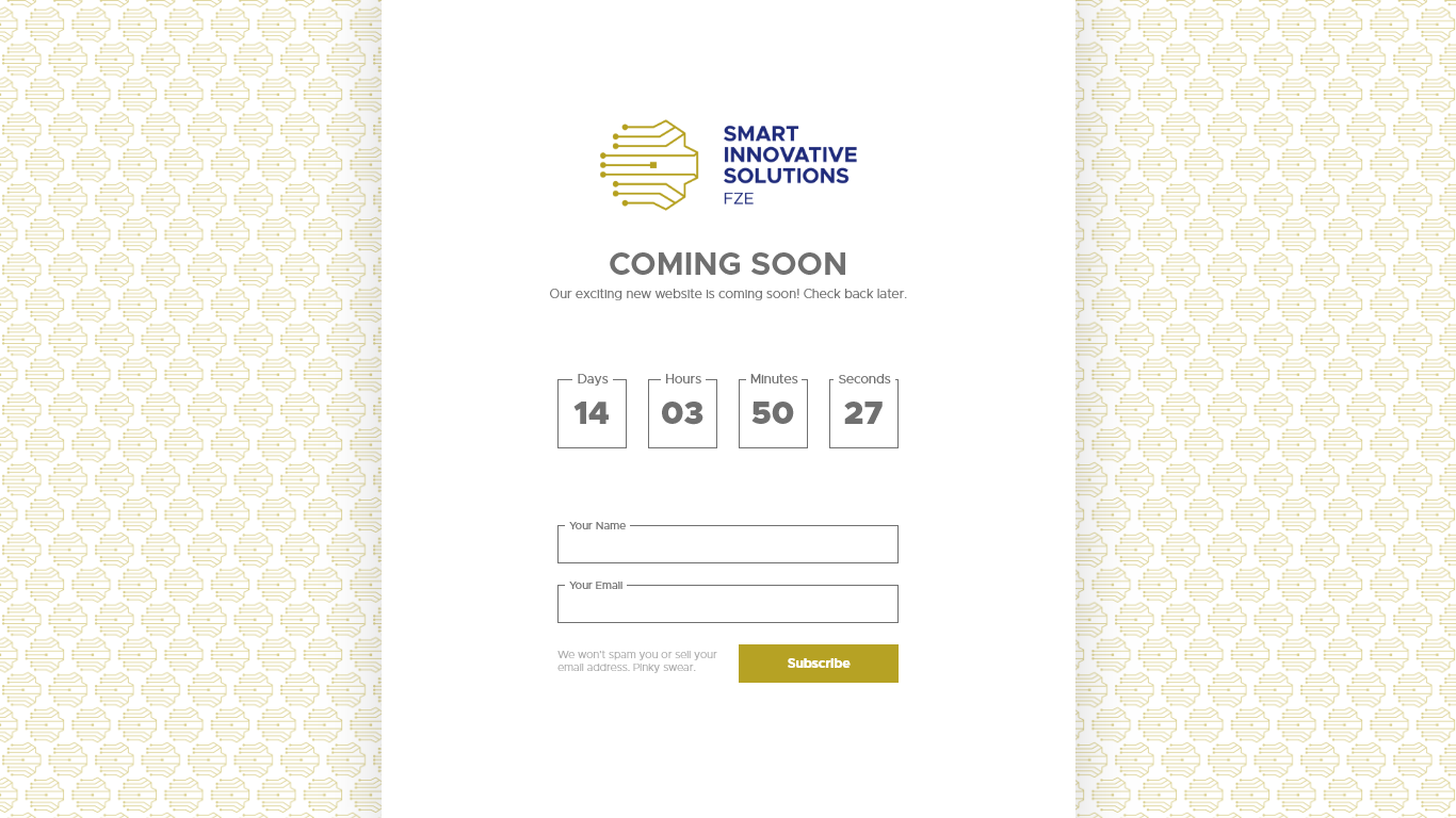
Signage, fleet, stationery, apparel, merchandise, social and web all run on the same geometry, with the pattern doing the work wherever the mark itself would have been too loud.


What happened
The concept was built out and shipped.
Smart Innovative Solutions adopted the identity and rolled it out: logomark and variations, brand book, pattern system, and the applications above. Concept to delivery, single-handed.
Got something that has to hold up at this range?
Brand identity, campaigns and motion. Designer based in Florence, working wherever the brief is.