Graphic Design
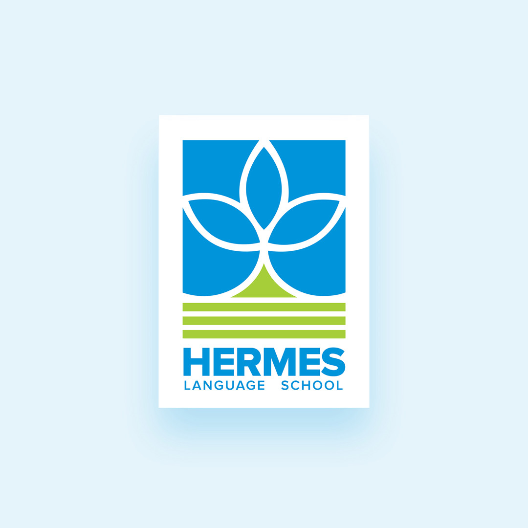
HERMESLOGO
Hermes is a language school that approached me with a specific challenge: they liked their logo, but it was not optimized for modern screens, and there were no vectorial version at hand.
Improvements
As there was no high quality or vector version available from the previous logo, I had to first recreate the original artwork. The next step was to fix the if there was any symmetrical issues that was seen in the original logo and make it pixel perfect. And at the last step two primary standard and bright colors were chosen as the identity.