

A brand and a website for Chianti Go, a new home for the food, wine and slow travel of the Chianti hills, built on the white road that links them all.
- Client
- Chianti Go
- Region
- Chianti, Tuscany
- Year
- 2026
- Role
- Sole designer and strategist
- Status
- Delivered
- Deliverables
- Brand strategy, Brand Identity, UI & UX Design, Email Layouts, Information Architecture
- Tools
- Adobe Illustrator · Adobe Photoshop · Figma
The territory
Famous for a wine. Made of a landscape.
Chianti is the hill country between Florence and Siena. Most people know the name from a bottle, but the place is bigger than the glass: stone villages like Greve, Radda, Gaiole and Castellina, vineyards and olive groves, woods and farms, all tied together by the strade bianche, the white gravel roads that wind between the cypresses.
Chianti Go sets out to gather all of it in one place. Visitors can buy wine, oil and cheese straight from the producers, book a farm stay, a tasting or a table, and find their way around the hills. Every producer gets a storefront of its own.
The platform had a name and a plan. It had no logo, no colors, no typefaces and no images.
The brief
Four jobs for one sign.
A logo for a platform like this has more to do than look good on a label. Before any drawing, the brief was written down as four jobs.
01
A sign for the region
Give Chianti a recognizable, consistent sign for its land, its products and its experiences.
02
More than wine
Speak for the whole mosaic: nature, culture, food, the outdoors and hospitality.
03
Trust
Anyone who sees the mark should know that what they find has been chosen with care.
04
Room to grow
Make the model ready from day one to travel to other regions.
It speaks to three kinds of visitor.
- International travelersThey know Chianti as a wine and want the rest of it: the landscape, the villages, the food, the outdoors.
- Slow travelersThey choose farm stays, bike routes, tastings and walks.
- Digital nativesThey book and shop online, and trust the platforms they recognize.
The positioning
The trusted way into the authentic products and experiences of Chianti.
Not only what you taste, but how you get there.
The concept · Le strade bianche del gusto, the white roads of taste
The concept
The white roads of taste.
Chianti’s white roads are famous in their own right. L’Eroica, the vintage bike ride, runs on them every year, and they stand for a slower way of crossing the land. They also join everything the platform offers: the winery, the olive mill, the farmhouse, the trattoria.
So the road became the symbol of the experience. It links products, places and people, and it invites you to set out and discover. The mark grew from three ideas.
The window
A square: a tile of a map, an icon on a screen, a small window onto the land.
The road
A white line that winds across the square and ties it together.
The mosaic
Four fields for the patchwork of crops and experiences.
The mark
Each field gets one sign of Chianti.
The mark
Four fields, one road.
Each field holds one sign of Chianti, drawn as simply as possible so it still reads at the size of a button.
- Wine. A bunch of grapes for the wine tradition, the historic heart of Chianti and its name around the world.
- Cypress. Three cypresses, the silhouette everyone knows from the Tuscan countryside and its roads.
- Fields. White furrows for hills worked by hand, the vines and the fields in rows.
- Olive. One olive for the oil and the Mediterranean farmland around it.
- The road. It runs through all four fields and joins wine, land, farming and oil into one experience.
The name sits beside it in Cardo capitals, a serif with the weight of history. Beneath, in Source Sans 3, a tagline gives the concept to an international audience in four words: The Road of Taste. A second line was offered with it, Every turn, a new flavor. It now opens the homepage.
In motion, the white road comes first. The fields open around it into the square, then the mark steps aside for the name.
Flat colors, simple shapes and clean contrast keep it legible where space is tight: a favicon, an app icon, a button.
Logo
Pictogram
The network
Chianti first. Then any region.
From the start the platform was meant to travel: to Umbria, to the Langhe, to any region with something to discover. So the name works on two levels. The territory changes, with a name and a pictogram of its own. GO stays.
GO got a mark of its own. Its letters are drawn as the two lenses of a pair of binoculars, an invitation to look closer and find what most visitors miss.

The idea · a pair of binoculars
The mark · two lenses, one word
- Two lenses. The G and the O are the same ring drawn twice, side by side, like the barrels of a pair of binoculars.
- One object. The rings overlap at the center of the tile, so the two letters read as a single shape.
- The bar. The G’s bar runs on into the O and holds the two lenses together.
- The tile. A soft square that makes GO a mark of its own, filled with the color of each region.
A dedicated mark does more than a word could. It is easy to recognize from one region to the next, it works as a seal on everything the platform selects, and a distinctive sign is harder to copy, so the original stays easy to tell from imitations. Each region can give it the color of its own landscape. In Chianti it takes the ochre of the fields.
Color and type
Warm earth, white roads.
The palette comes straight from the land: wine red, the dark green of the cypresses, golden ochre and olive green. It stays warm and natural, far from the cold blues of technology, yet clean enough for screens. Ochre leads, the color of fields at sunset and dusty roads. White does the rest: the road, the icons and the space around them.
The palette · ochre leads, white carries the road
Two typefaces share the work. Cardo, a serif with humanist roots in manuscripts and early printing, brings history and authority to the logo and the titles. Source Sans 3 carries everything else, clear and quiet on any screen.
- CHIANTICardo Bold · the name
- Every turn, a new flavor.Cardo Regular · titles
- THE ROAD OF TASTESource Sans 3 Bold · tagline
- Book a tasting in Radda, then ship the oil home.Source Sans 3 Regular · interface
Cardo for history · Source Sans 3 for clarity
In use
From the hills to the front door.
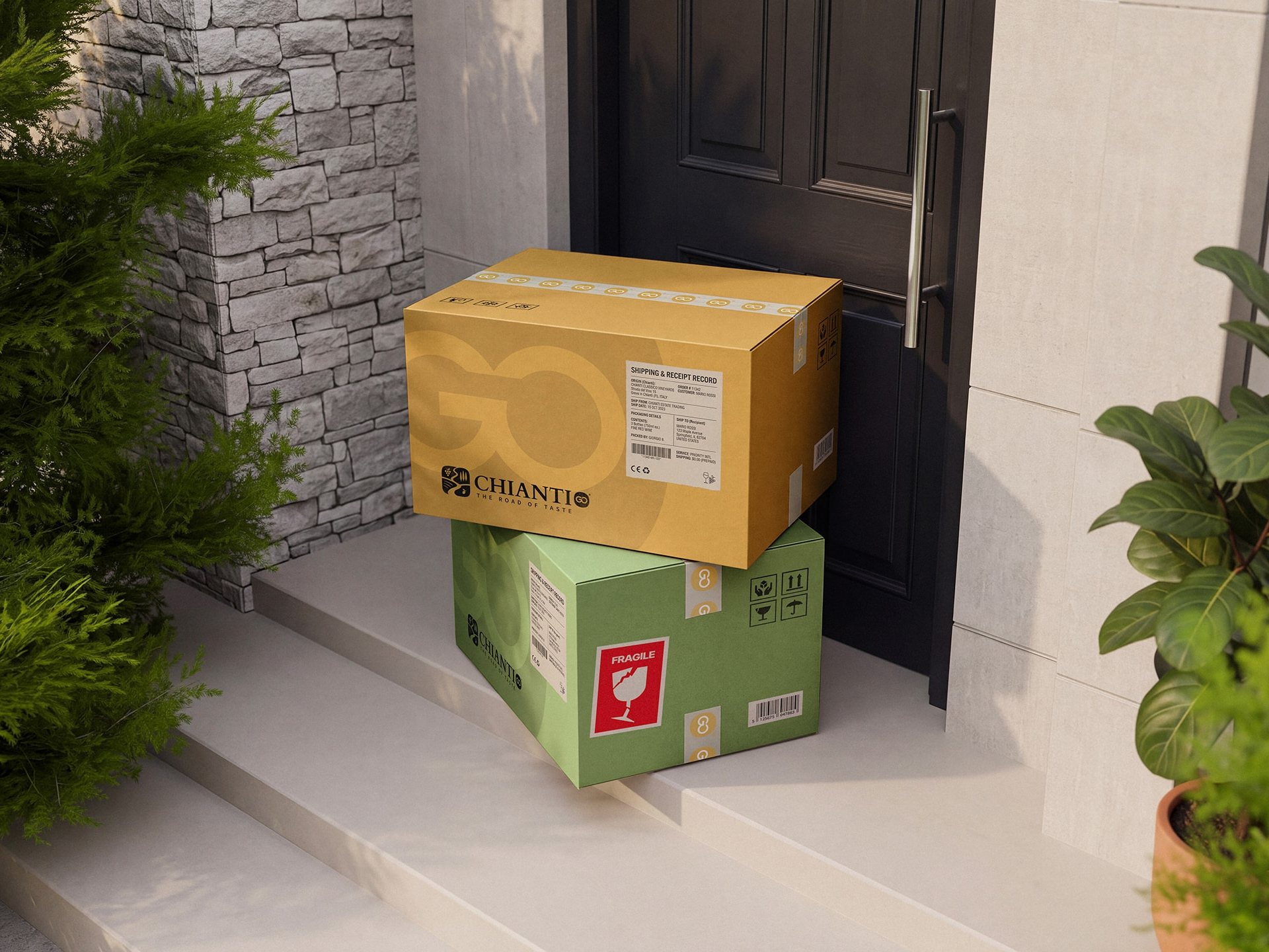
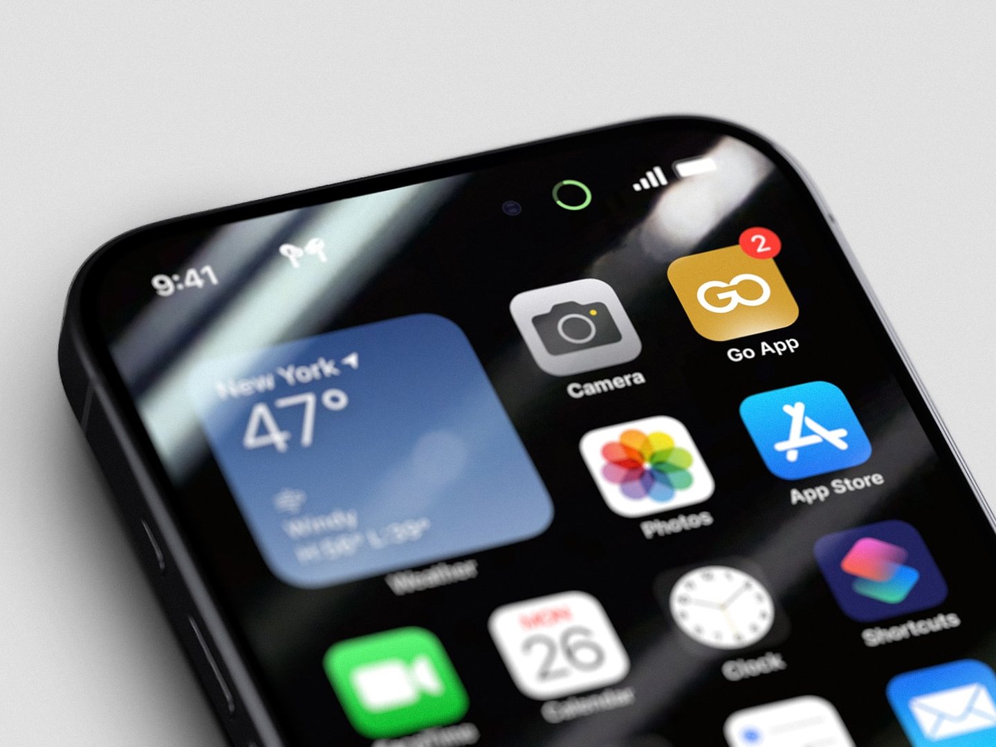
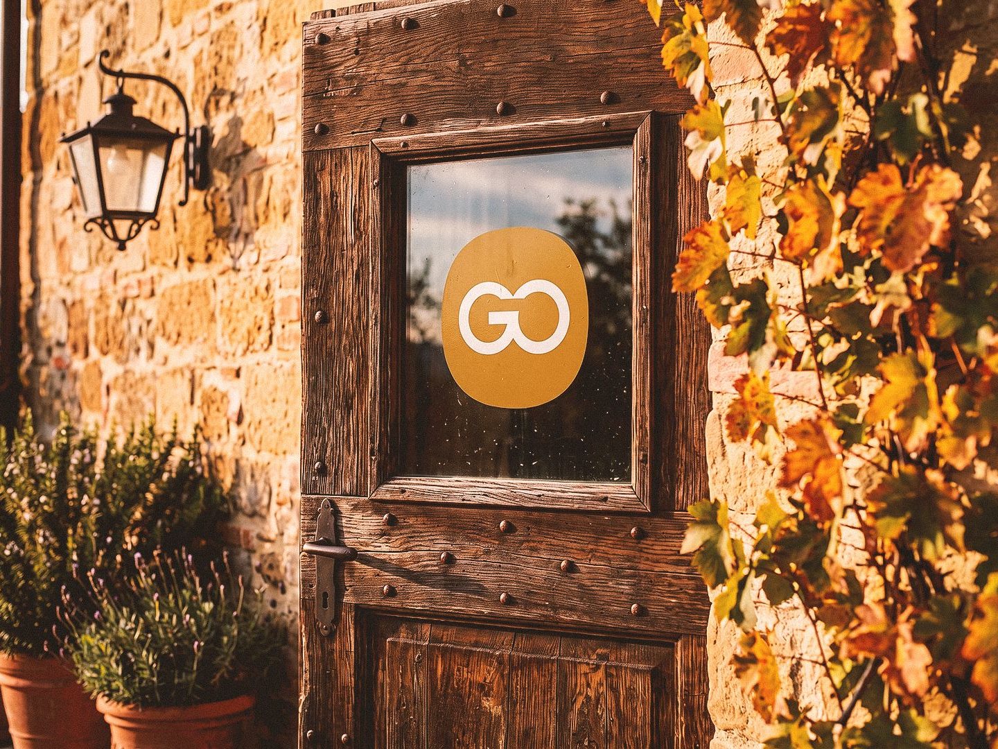
Away from the screen, the identity has to hold up on a box, a phone and a door. Orders leave the producers in ochre and green boxes sealed with GO tape, so a delivery is recognizable before it is even opened. On the phone, the app keeps only GO, the part of the name that stays the same in every region. And on a producer’s door, the GO seal tells visitors the place has been chosen with care.
The platform
Shop the hills, then go and see them.
The identity carries through the whole platform, designed page by page in two phases: first the shop, then booking. The homepage opens on the region and sends visitors three ways: to the shop, to booking and to the producers themselves.
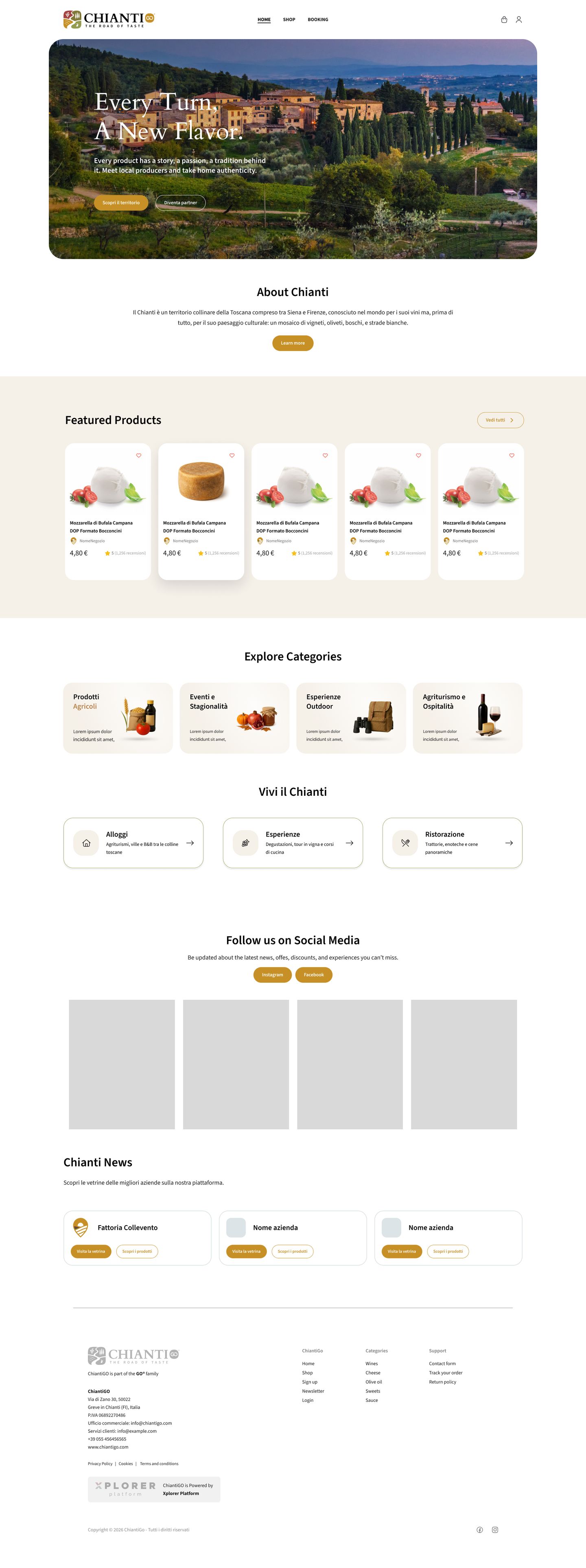
Every producer, from a winery to an olive mill, gets a storefront with its story, its products and what it offers to visitors. A page on the region tells the story of the land, and the shop gathers everything by category and price.
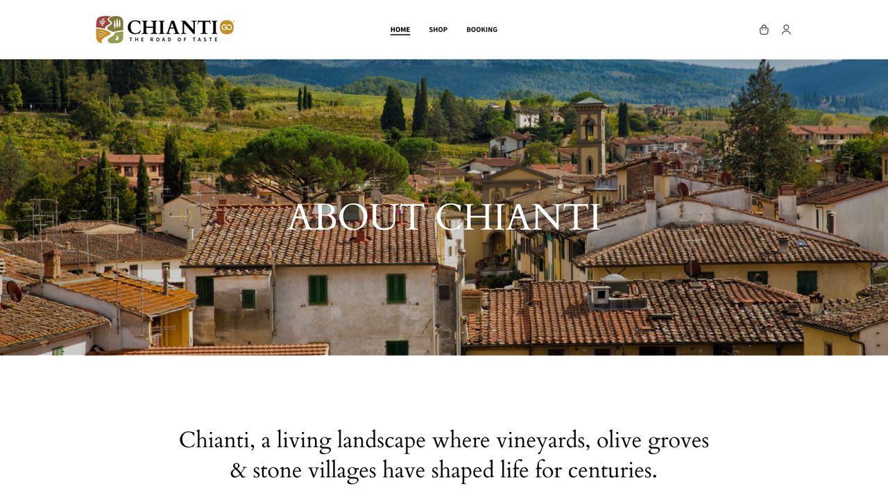
The region · its story
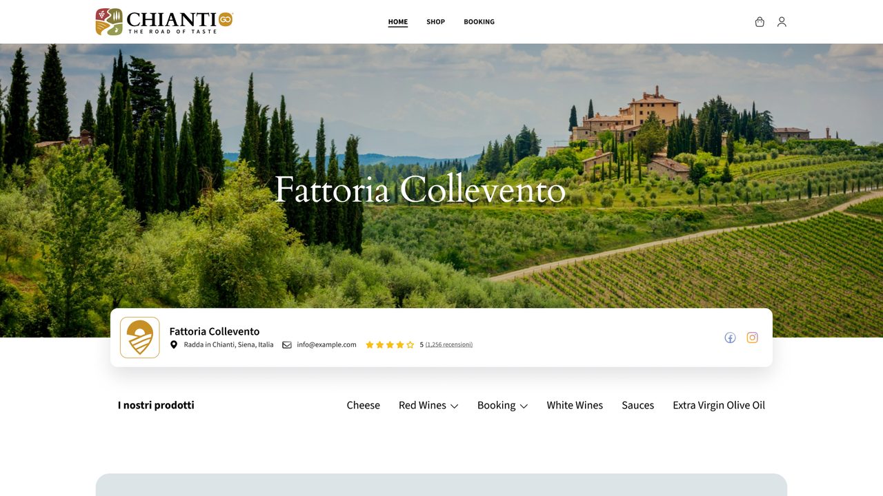
A producer · storefront
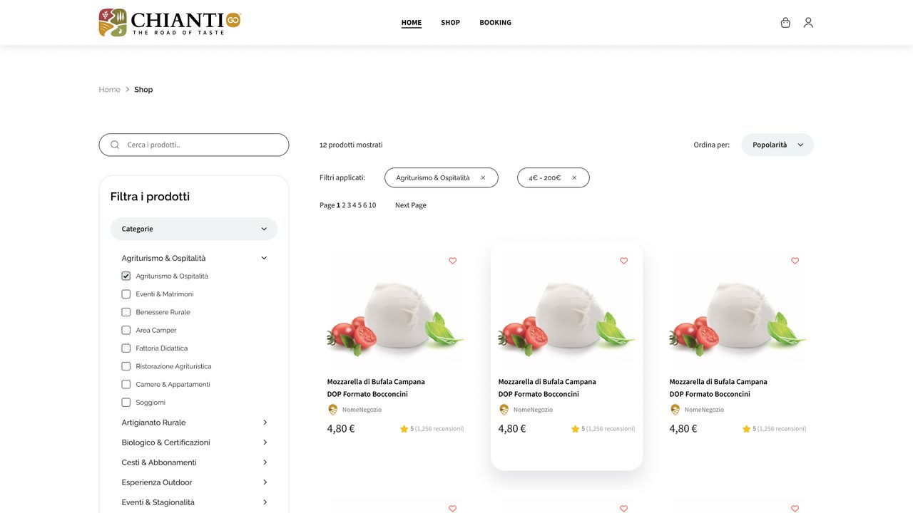
The shop · filters and products
Booking covers stays, experiences, dining and getting around, in four steps. The confirmation carries a QR code for the day of the visit.
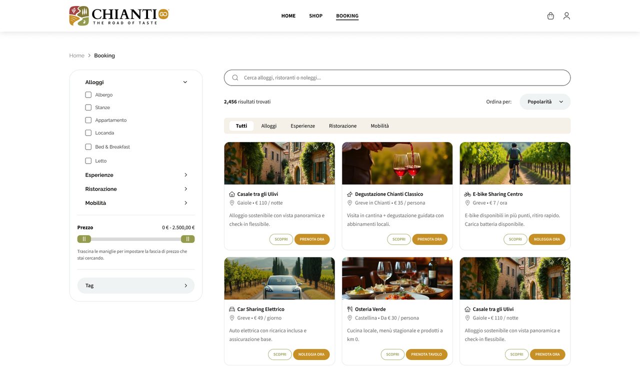
01 Find · stays, experiences, dining, transport
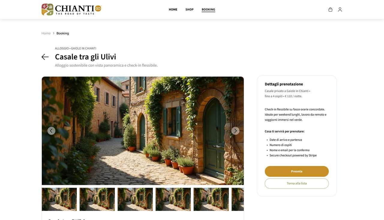
02 Choose · the stay in detail
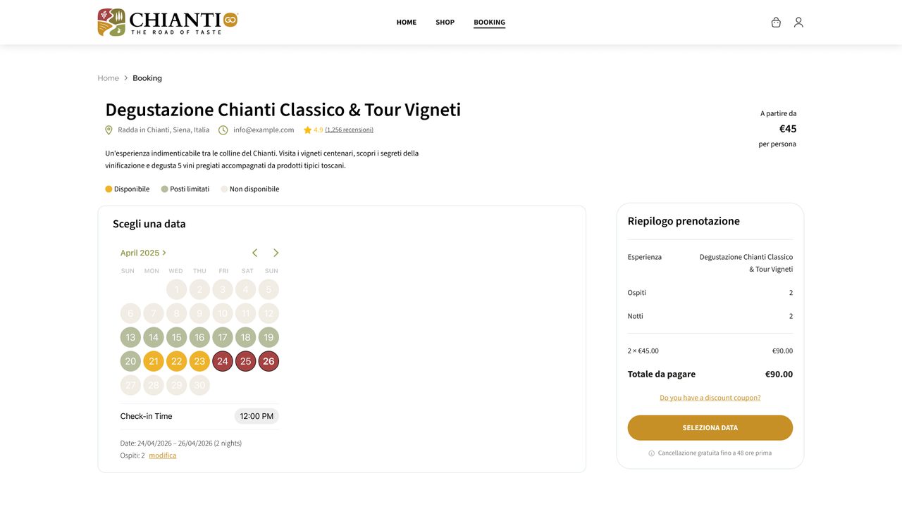
03 Pick a date · availability at a glance
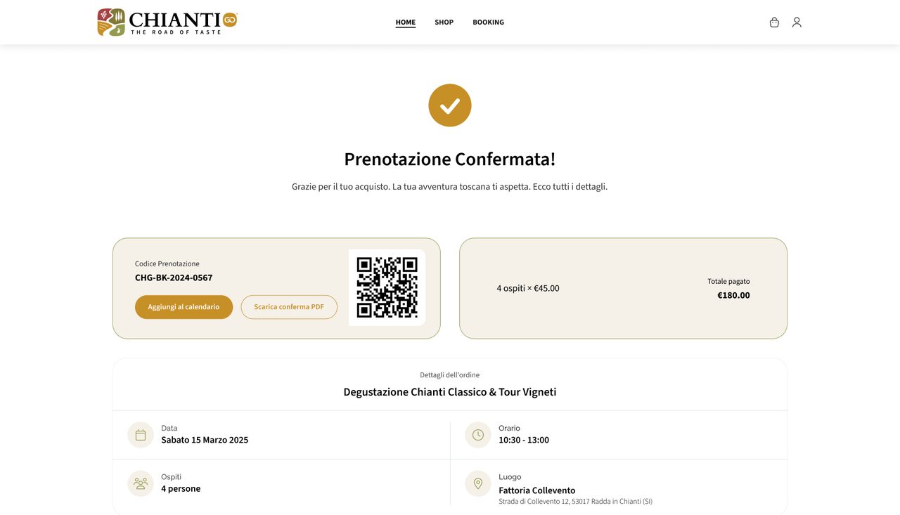
04 Confirmed · booking code and QR
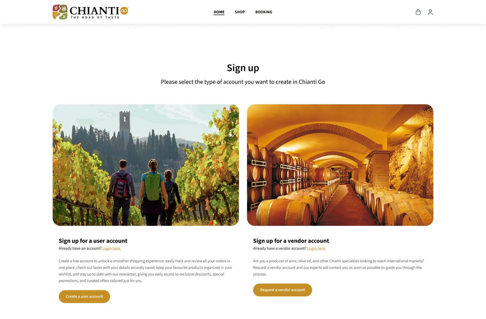
There are two kinds of account: one for travelers, one for producers who want to sell. Orders can be followed step by step, on a desktop or a phone.
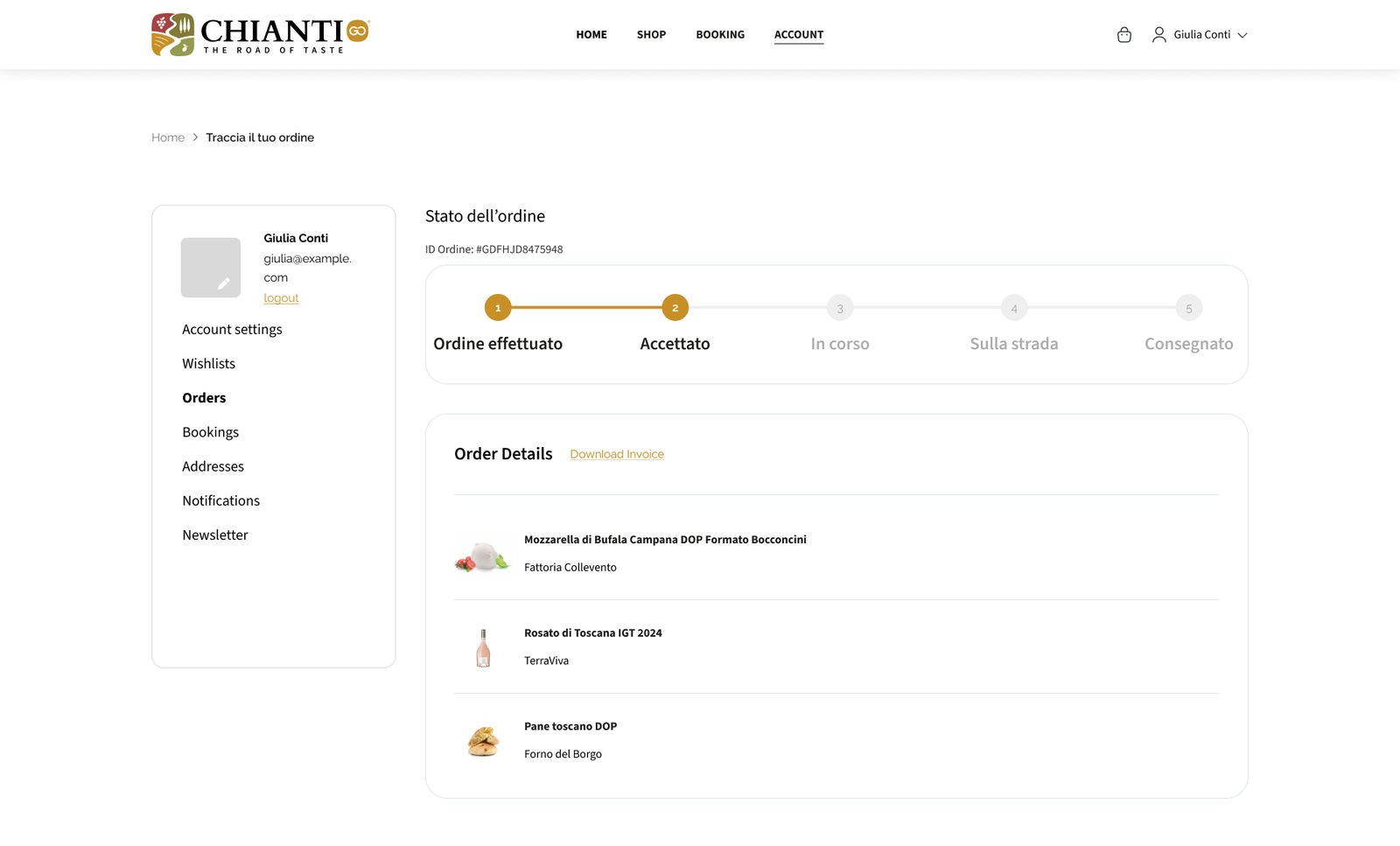
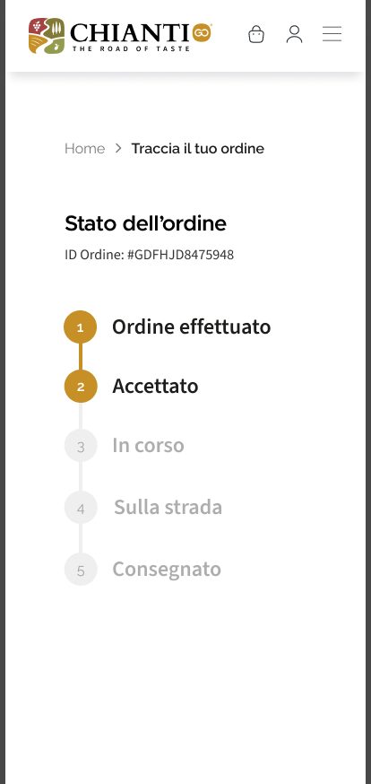
The brand reaches the inbox too: seven emails, from the welcome message to the shipping update, on the same warm white with ochre buttons.
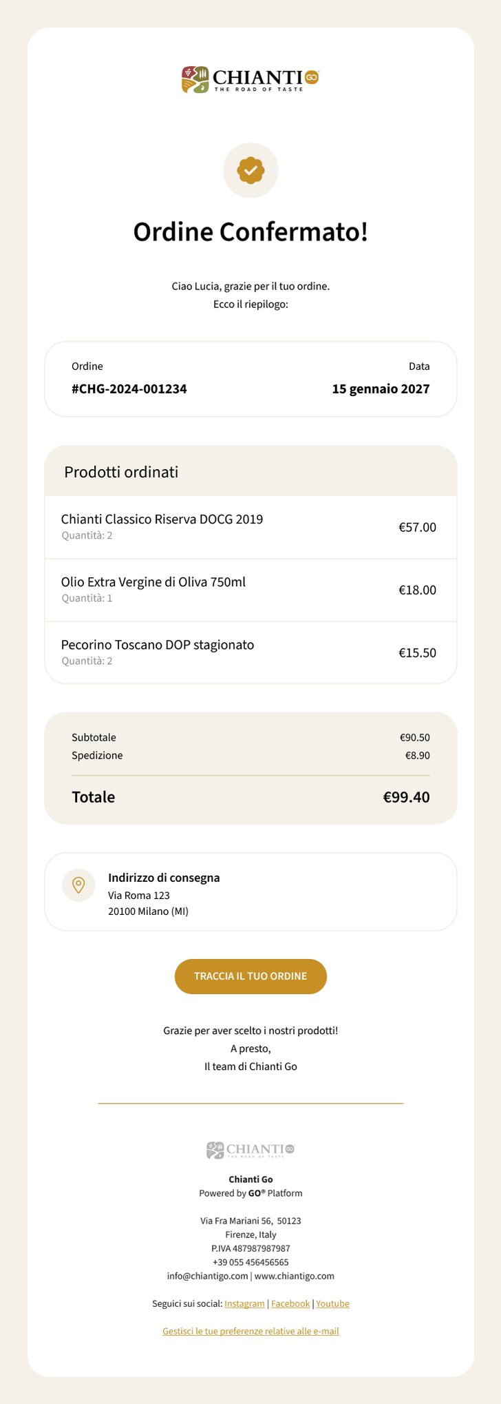
Order confirmed
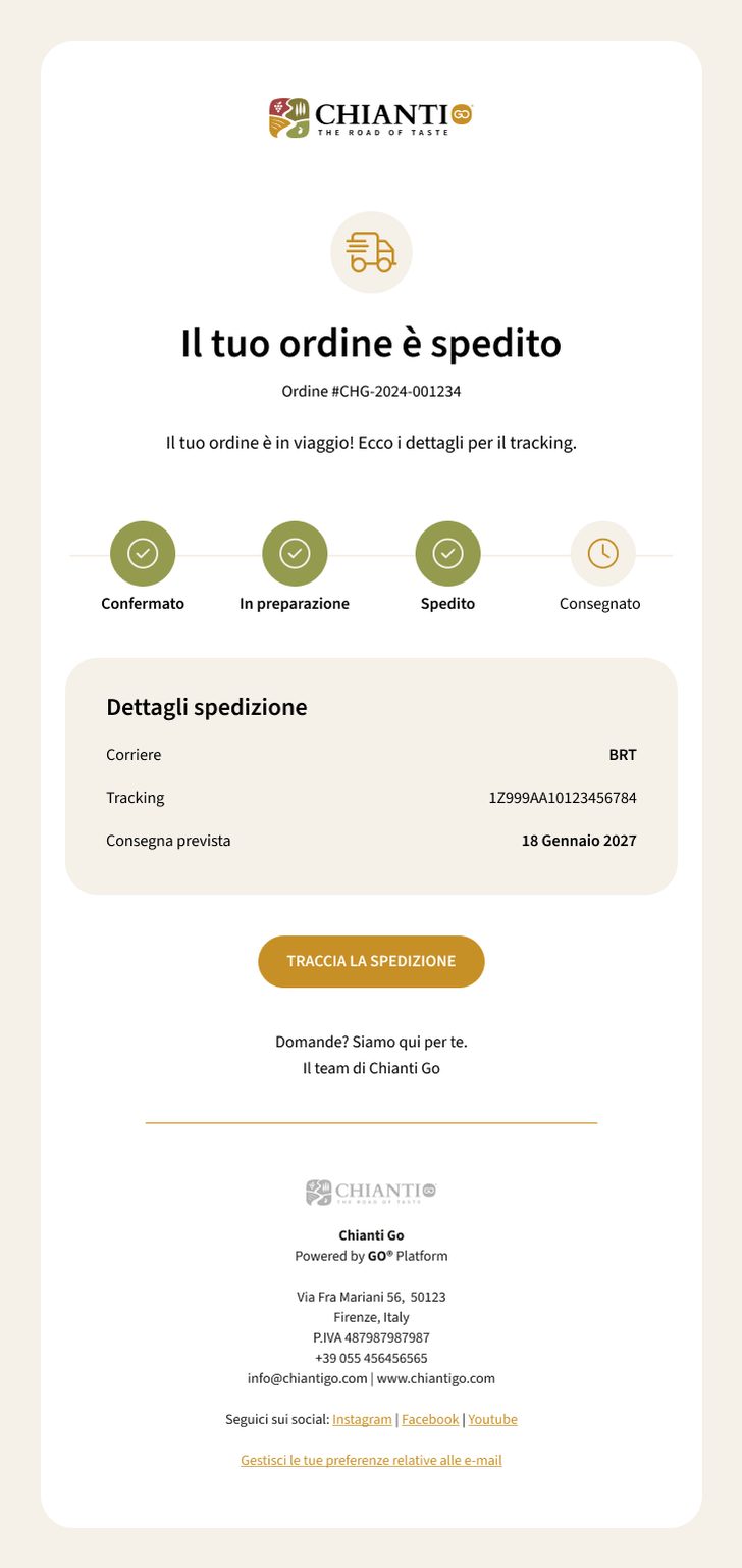
Order shipped
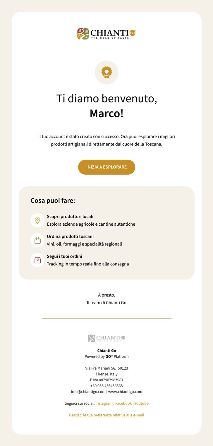
Welcome
Need a brand that travels well?
Brand identity, web design, campaigns and motion. Based in Florence, working wherever the brief is.