

A rebrand for a Florence e-commerce platform provider, built from the strategy up.
- Client
- Vudoo S.r.l., Florence
- Sector
- E-commerce for small to medium size businesses
- Year
- 2023
- Role
- In-house designer, the only one on the project
- Status
- Shipped and in use
- Deliverables
- Brand Strategy, Brand Visual Identity, Launch Video
- Tools
- Adobe Illustrator · Adobe Photoshop · Adobe After Effects · Figma
The starting point
Vudoo helps small businesses sell online. It builds the shop, puts the products on the big marketplaces and handles orders and promotion, so the owner never has to become an e-commerce expert. The promise is simplicity. The old logo was saying something else.
- The frame boxes the mark in. It looks busy, it’s hard to remember, and it shrinks the logo, so small sizes suffer.
- The crossing lines read as two X’s, the sign for no, wrong or not verified.
- Round stroke ends feel playful and informal, closer to toys, families and food.
- Tall, condensed capitals speak fashion and luxury. Uppercase brings power, but not innovation.
The second point weighed the most. Next to .notdef, the box a font draws when it can’t find a character, the old mark looks almost identical: an unfortunate resemblance for a company that sells technology.
Strategy first
Four questions before any drawing.
A logo can only say what a company already knows about itself. So the work started with Vudoo’s foundations, each one answered in a single sentence.
WHY
Purpose
Make selling online simpler and easier for every small business owner.
WHAT
Vision
A world where anyone can use the technology within reach to turn products, services and ideas into a real business.
HOW
Mission
A platform simple enough that owners can focus on making and selling while Vudoo handles the technical side.
WHO
Audience
Small and mid-size businesses, short on time, money and staff, with no tech team to figure out selling online.
From those answers came five values (simplicity, innovation, empowerment, growth and customer focus) and a personality to design toward.
- Sincerity
- Excitement
- Competence
- Sophistication
- Ruggedness
Brand personality · Jennifer Aaker’s five dimensions
Competence: smart, reliable, good at the job. Closer to UPS or Volvo than to a toy brand, which is exactly where the old logo had drifted. The voice follows the same line: optimistic, empowering and friendly.
In un mondo dove tutto cambia, anche l’e-commerce può cambiare.
In a world where everything changes, e-commerce can change too · the line on the brochure cover
The mark
Two diamonds, overlapping where the physical and the digital meet.
The old mark had a diamond at its center, lost between two X’s. The new one is built from that diamond: two of them, overlapping, with no frame and nothing crossed out.
The concept works on three levels, each tied to the strategy. Read as two peaks and their reflection, the mark stands for strength and growth. Read as two diamonds, it stands for excellence: reliable, rare, top-notch. Read as two overlapping worlds, it holds Vudoo’s whole idea, the physical shop and the digital market meeting in the middle.
One detail carries the innovation idea into the letters themselves: the V cuts into the u. Its arm takes the corner off the next letter, parallel to its own edge, a literal cutting edge for a company built on new technology.
The wordmark is lowercase, for a brand built on innovation, and wide and heavy so it stays solid at small sizes. Beneath it sits a short tagline that says what Vudoo is: The Digital Hub. The type is centered on the mark, inset by the same amount top and bottom, and the tagline starts exactly at the foot of the V.
Free of the frame, the new logo holds up where the old one fell apart: at small sizes.
Before
After
The system
Blue leads, as the color most tied to competence: intelligence, trust, efficiency. Yellow is the accent, with cyan, orange and indigo in support.
Core palette · primary, accent and three tertiaries
One typeface carries everything: Inter. ExtraBold for headlines, Light for the lines beneath them, Bold and Regular for labels and small text. Drawn for screens and clear at any size, it suits a brand built on competence.
- ExtraBold Headlines
- Bold Labels and figures
- Regular Small text
- Light Lead text
Inter · one family for headlines and text, Light to ExtraBold
Online
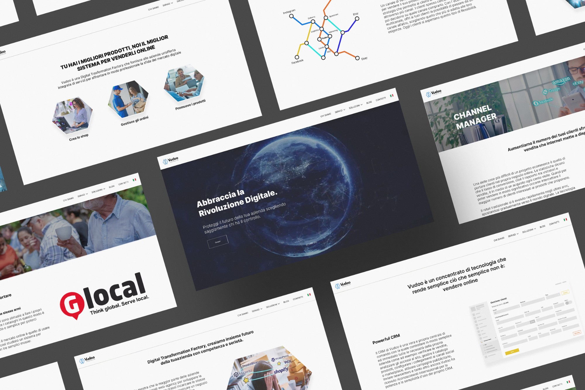
The website, designed page by page in Figma, is live at vudoo.org.
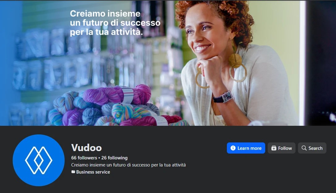
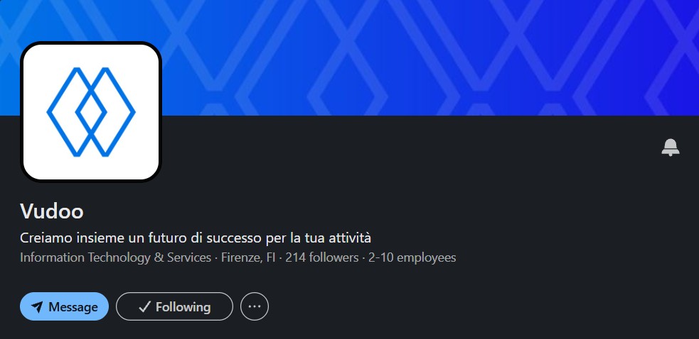
Bold Inter headlines over Light text, plenty of white and real owners at work carry the system from the homepage to every service page. On social, the mark stands alone as the profile picture on Instagram, Facebook and LinkedIn, white on blue or blue on white. The Facebook cover carries the brand line, and the LinkedIn cover turns the diamond into a pattern.
In print
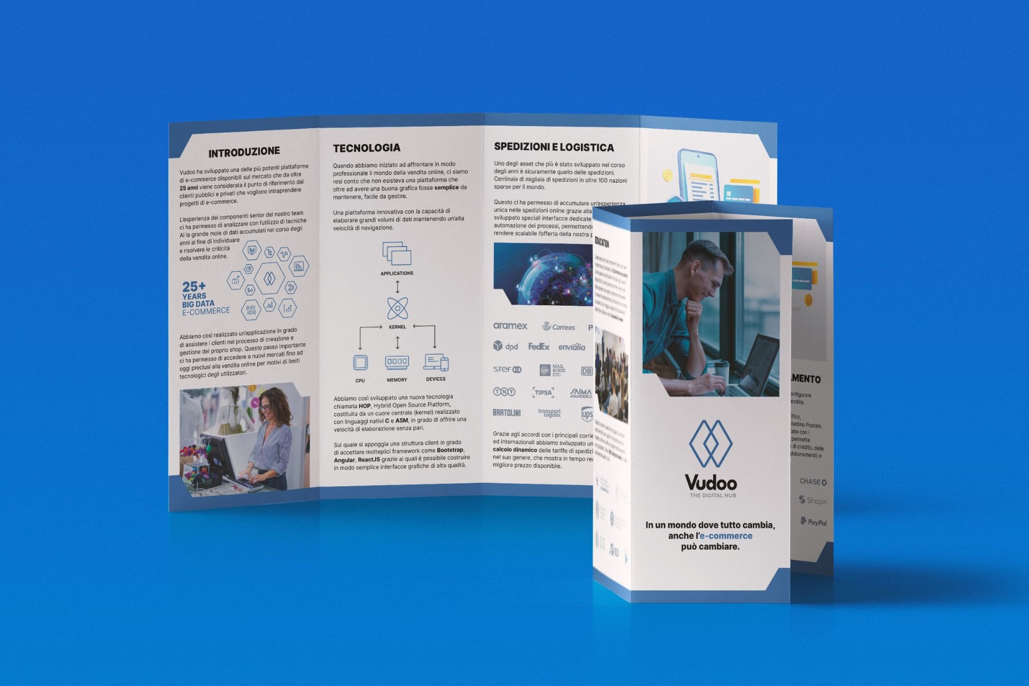
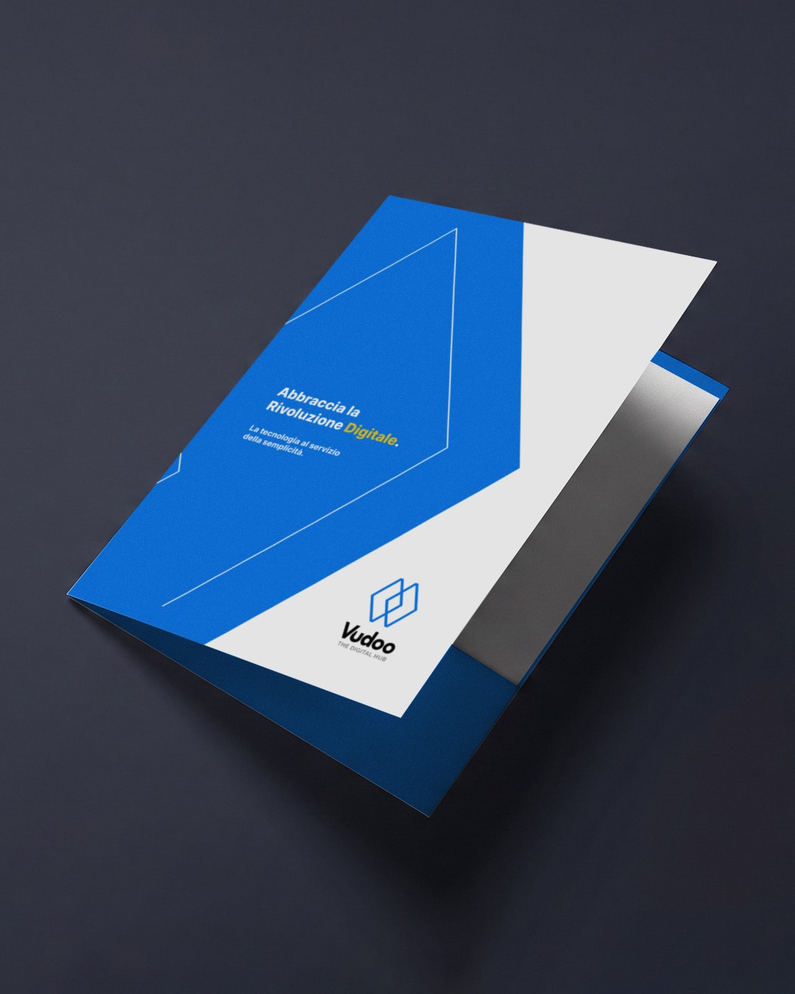
The brochure walks through the whole platform in eight panels, from shipping and payments to the academy, folded as an accordion.
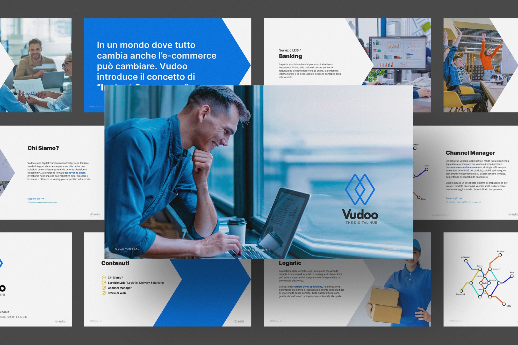
For screens, a digital brochure tells the same story in landscape pages: who Vudoo is, the logistics and banking services, the channel manager and the client stories.
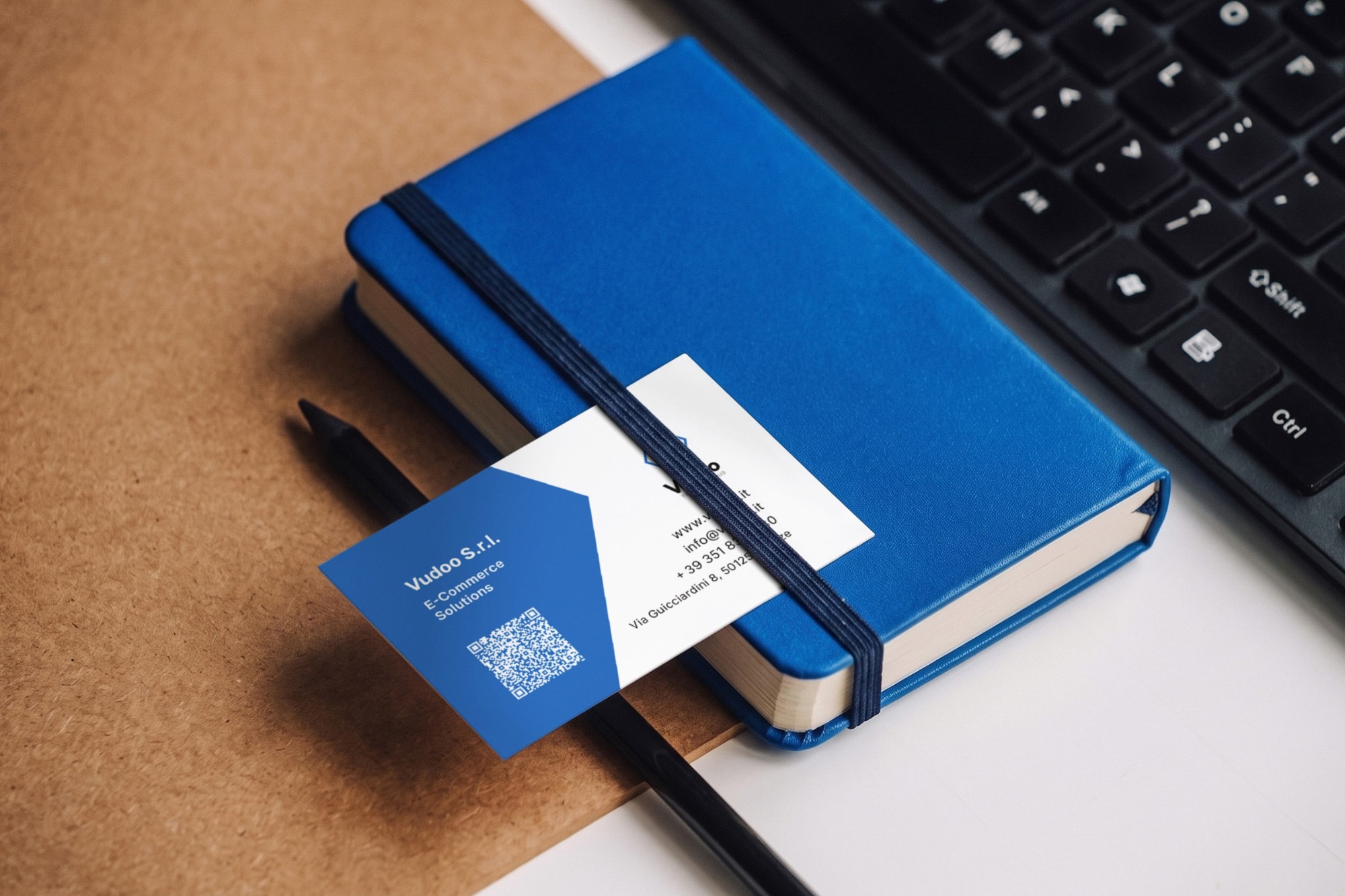
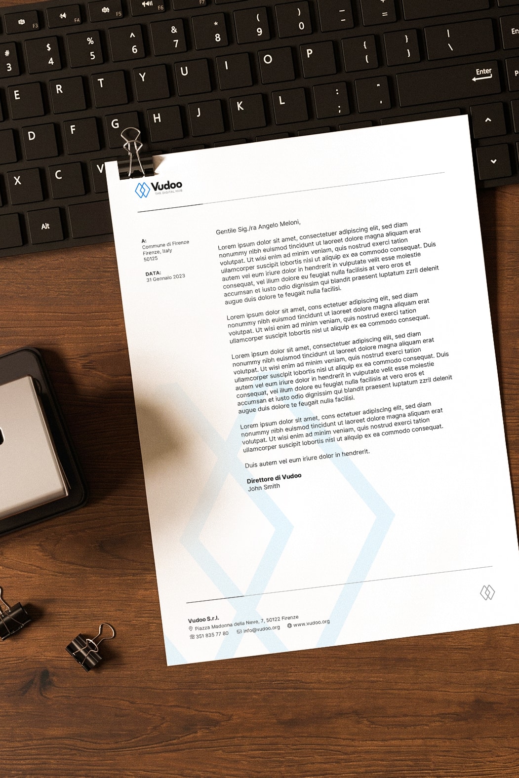
The same system runs through the stationery.
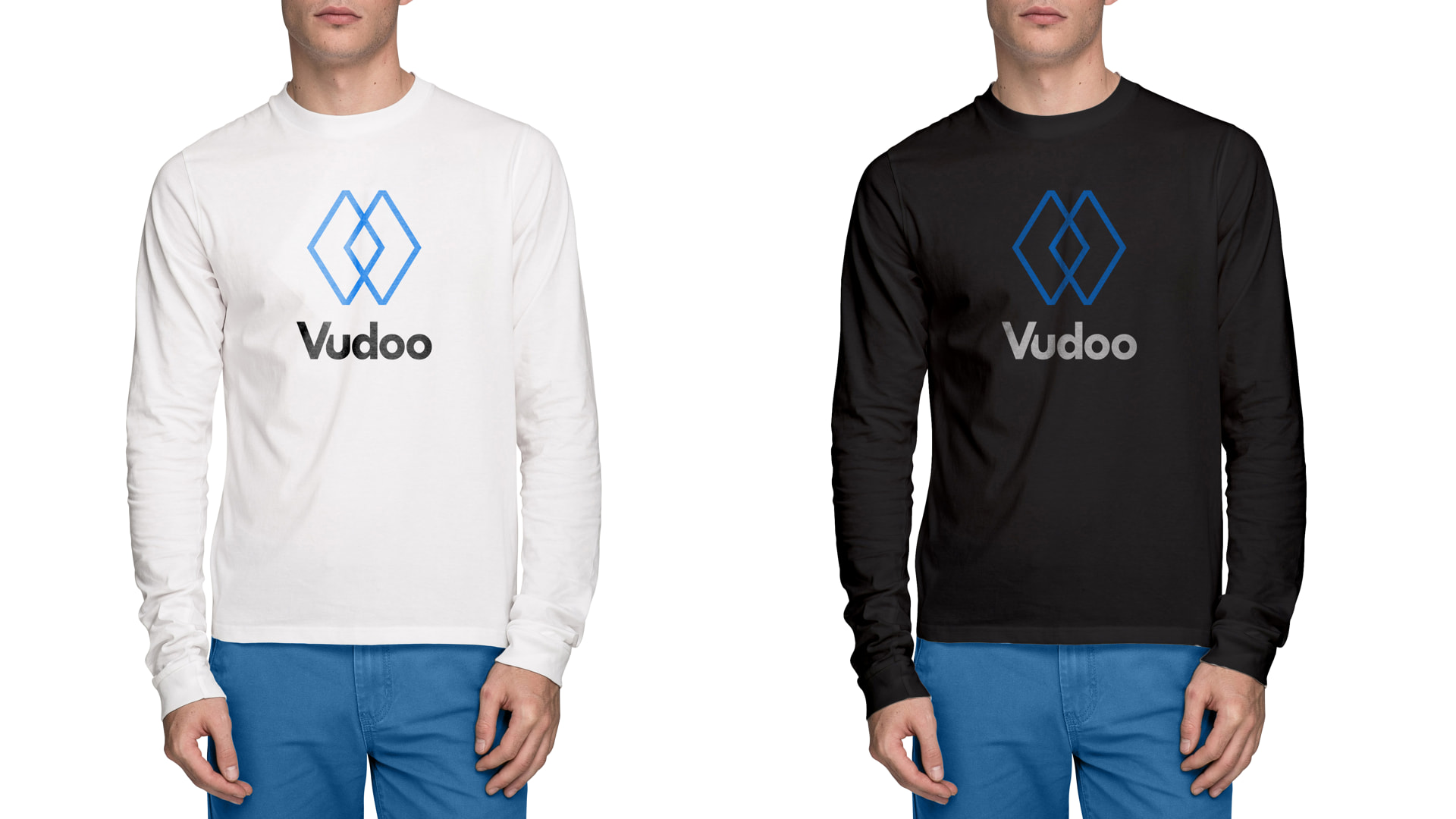
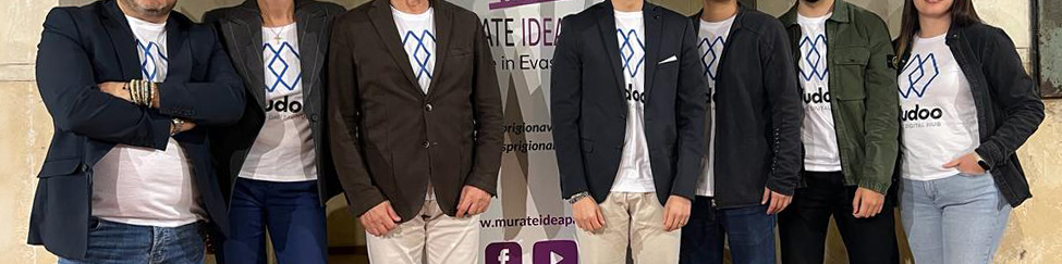
For the team, the stacked logo moved onto shirts, in white and in black colors.
The launch
The story first, then the logo.
The new identity was presented to the public at a launch event in March 2023, opened by a one-minute film. The film follows the same order as the project. Before any logo appears, it sets out Vudoo’s vision of a more accessible e-commerce world and its mission: to simplify every part of selling online, and to bridge the gap between the physical and the digital world.
Only then is the new identity revealed. Strength, excellence and growth each get their own scene, framed as what Vudoo promises its clients and partners. The film closes on the brand’s belief that every business should be able to use technology to grow, as the mark builds itself one diamond at a time into the stacked logo. The audience heard the reasoning before they saw the result, so the identity arrived already carrying its meaning.
Is your logo saying something you didn’t mean?
Brand identity, campaigns and motion. Based in Florence, working wherever the brief is.