Graphic Design
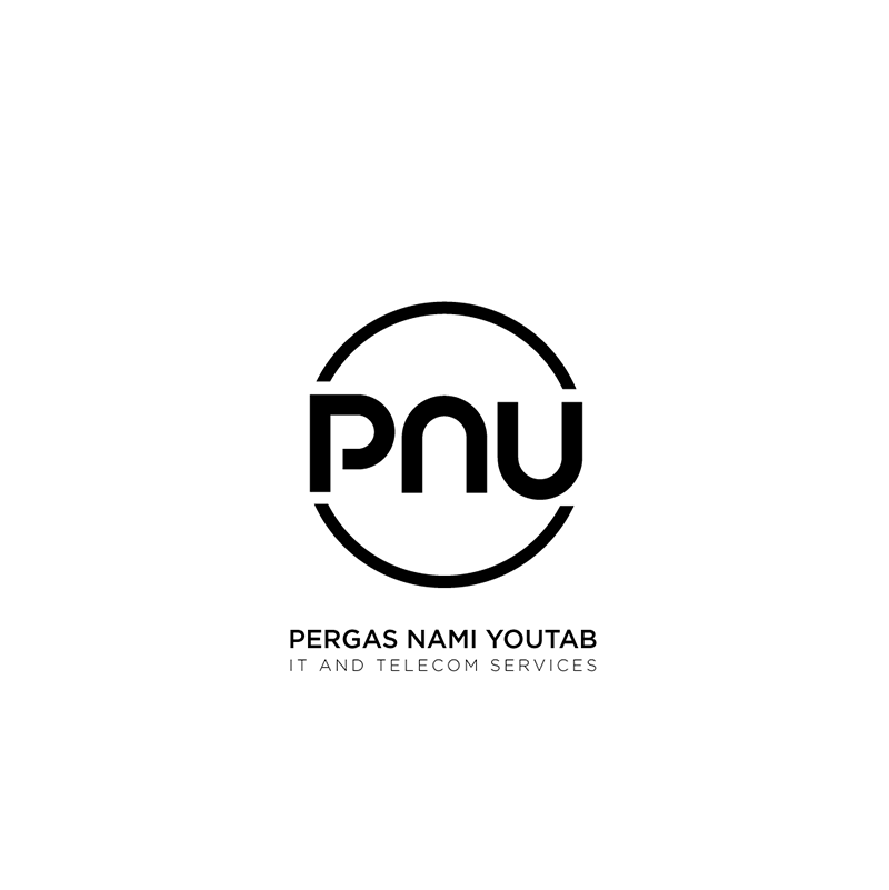
PNULOGO
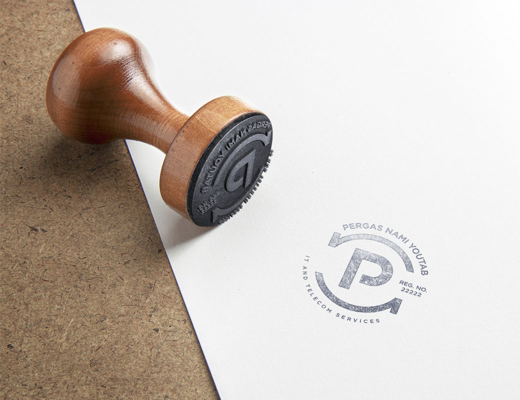
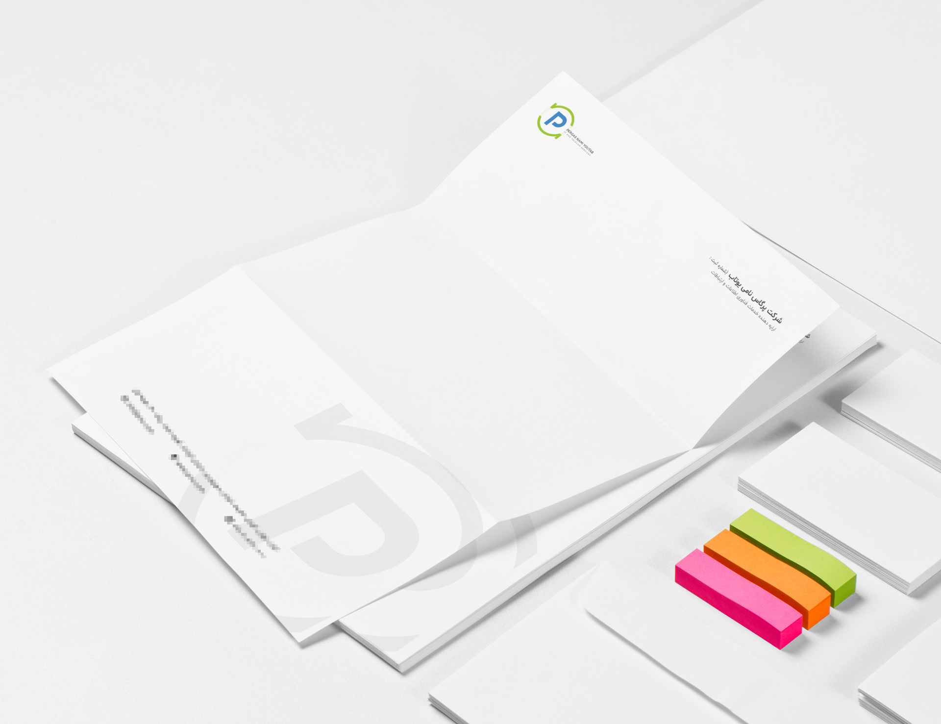
Pergas is a small business providing IT and Telecom services.
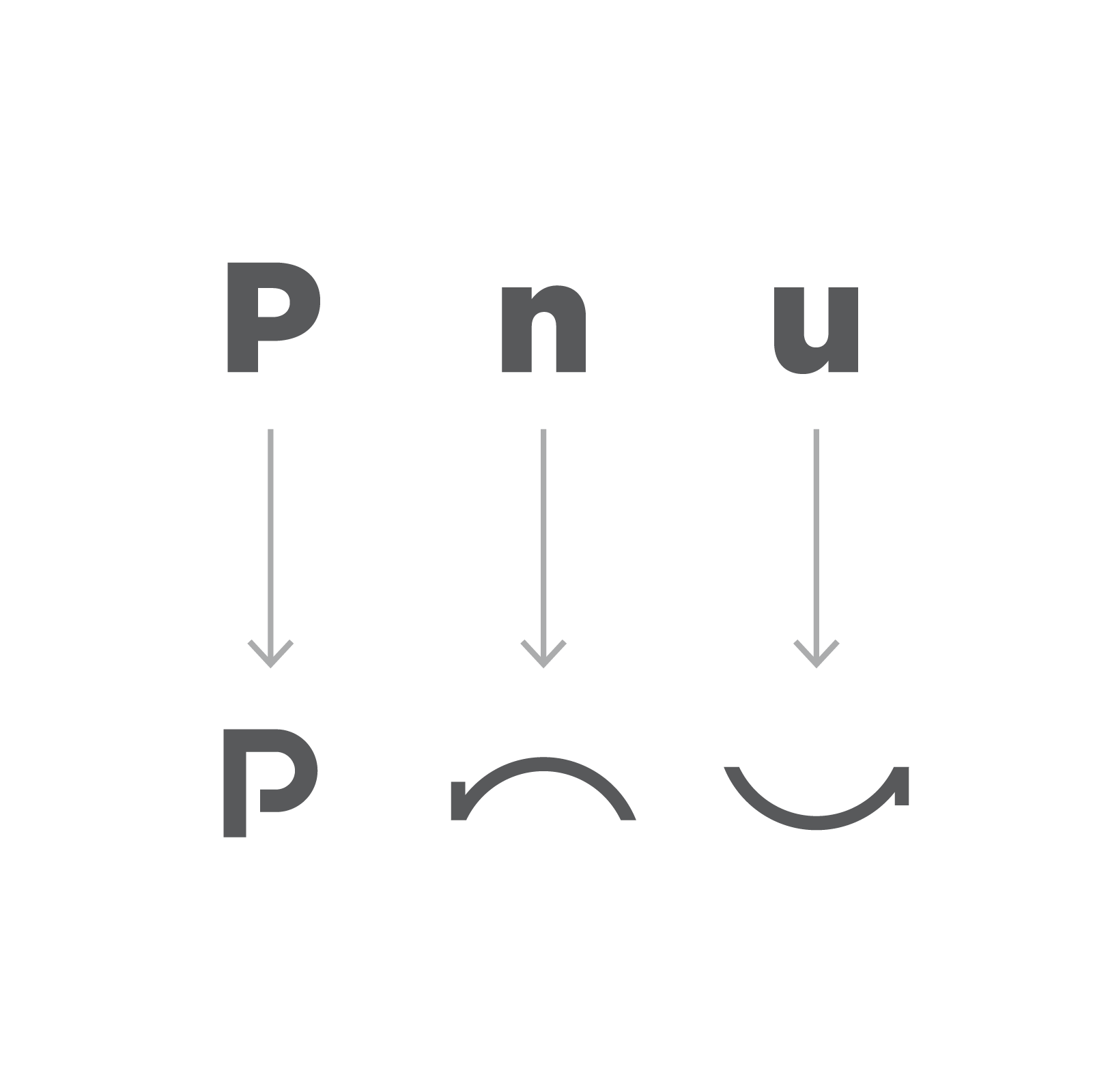
Concept
The founders needed the logo very fast. So I had to come up with a pretty quick and routine idea. The two arrows in the logo resemble the flow of data. Also the up and down or in and out of data. Placing them in a circular around the special form of P character shows the global reach and flow of data.
Final Result
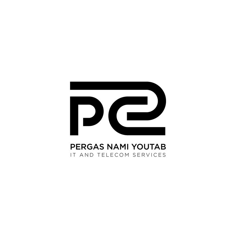
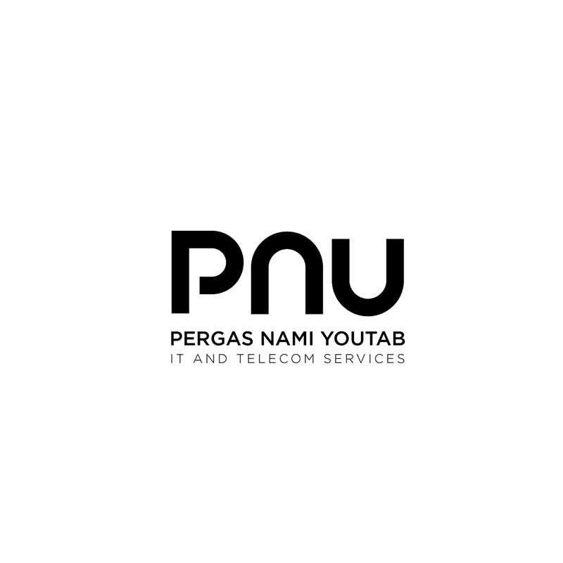
Other Designs
Stationary Set and Stamp
Made with
Adobe Illustrator