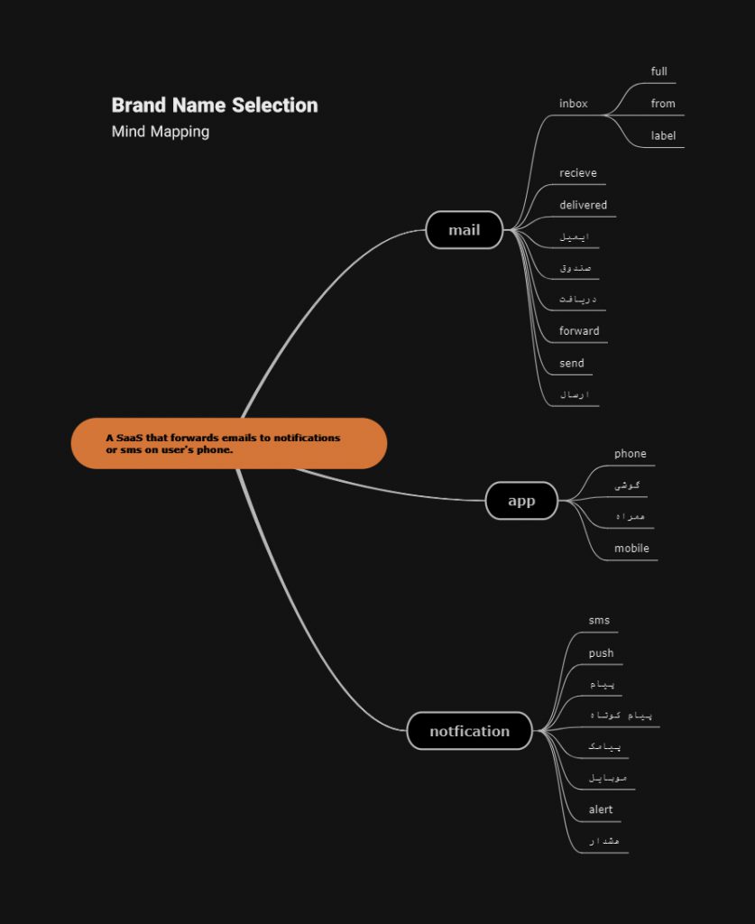
First Step: Name Selection
A simple web application that would forward your emails to your SMS.. They company founders needed a name and a visual identity for their upcoming product. So for the first step I mind mapped all the information also English and non-English keywords that were somehow related to the product. And finally came up with idea of PayamApp. Payam means message in Persian.
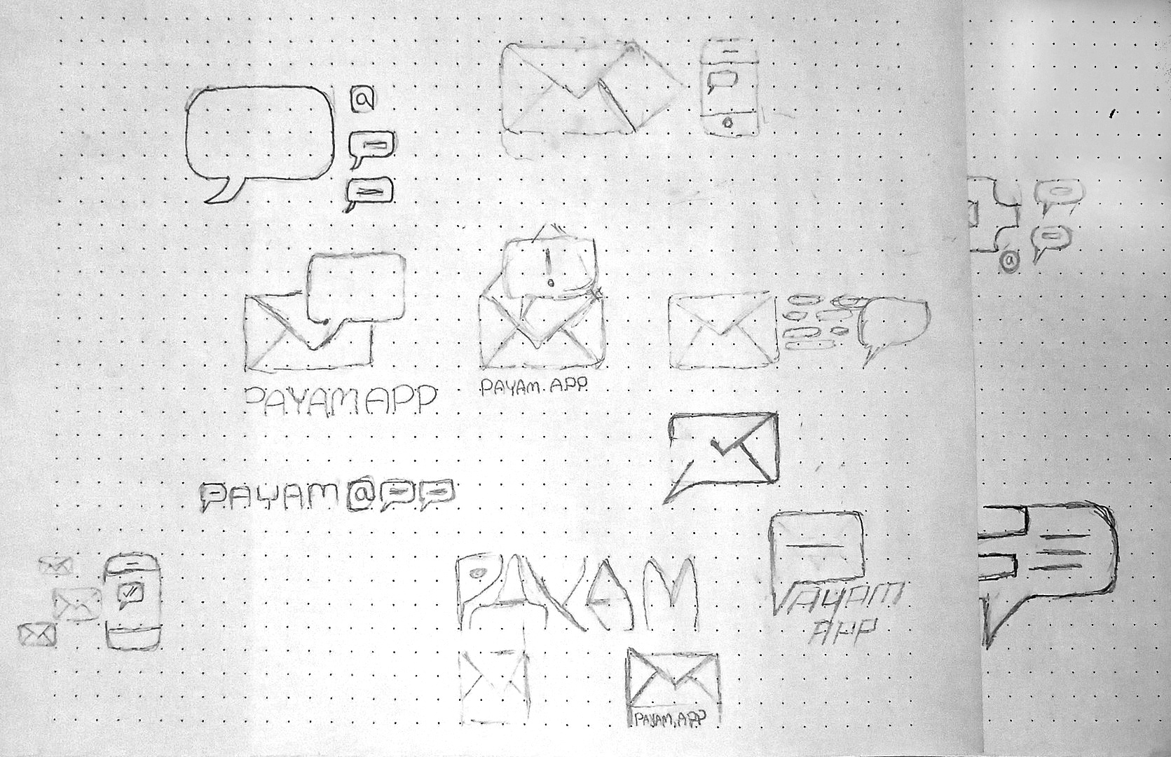
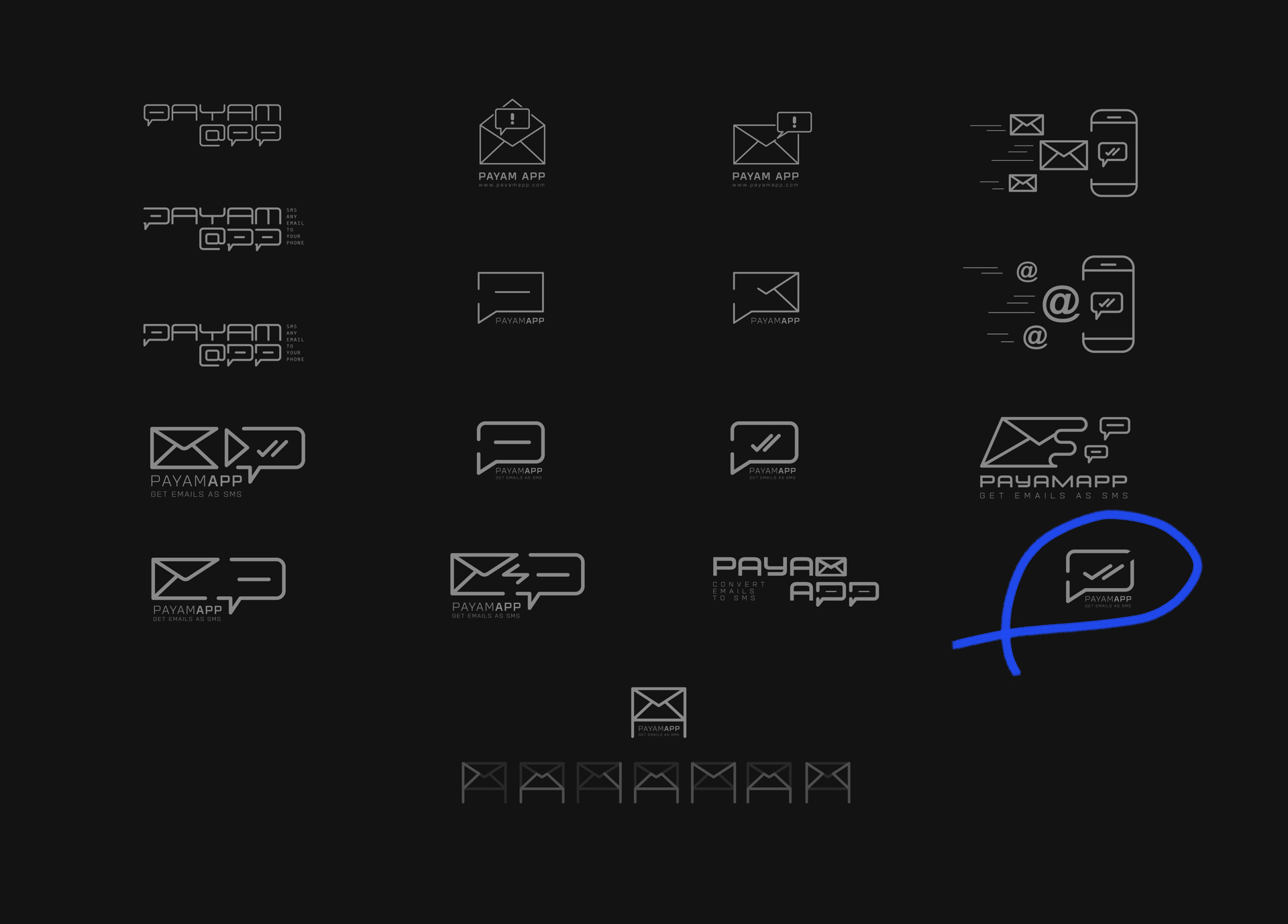
Second Step: Logo Design
The next step was to propose a design that would contain the main purpose of the product, which was delivering messages. Thanks to the mind map and mindset I have acquired in the previous step, I started to sketch ideas and build my very own tiny idea board. And a final candidate which was accepted by the founders.
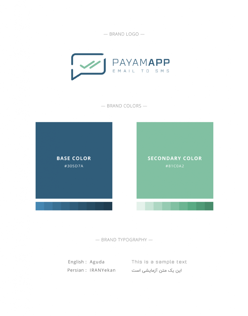
Final Step: Style Guide
After the final logo design was chosen by the founders, I had to select two primary colors for the product along with a type family. I selected a primary color that would convey a feeling of safety and calmness. Then using the complementary method of color harmony principles, extracted the second color that would complement the hero color best. Eight shades and tints variant for each the colors were also implemented in the final style guide.
Made with
Adobe Illustrator