

An unnamed alphabet from a 1946 lettering book, lifted off the printed page and redrawn letter by letter into a working digital typeface.
- Source
- Book of Alphabets, Chicago, 1946
- School
- IED Firenze
- Advisor
- Prof. Andrea Tartarelli
- Year
- 2022
- Role
- Sole designer, research to font file
- Status
- Working font, v1.0
- Deliverables
- Powner Regular in TTF, WOFF and WOFF2 · 26 capitals, 10 figures, ampersand, period and comma · type specimen
- Tools
- Glyphs · Adobe Photoshop · Adobe Illustrator
The source
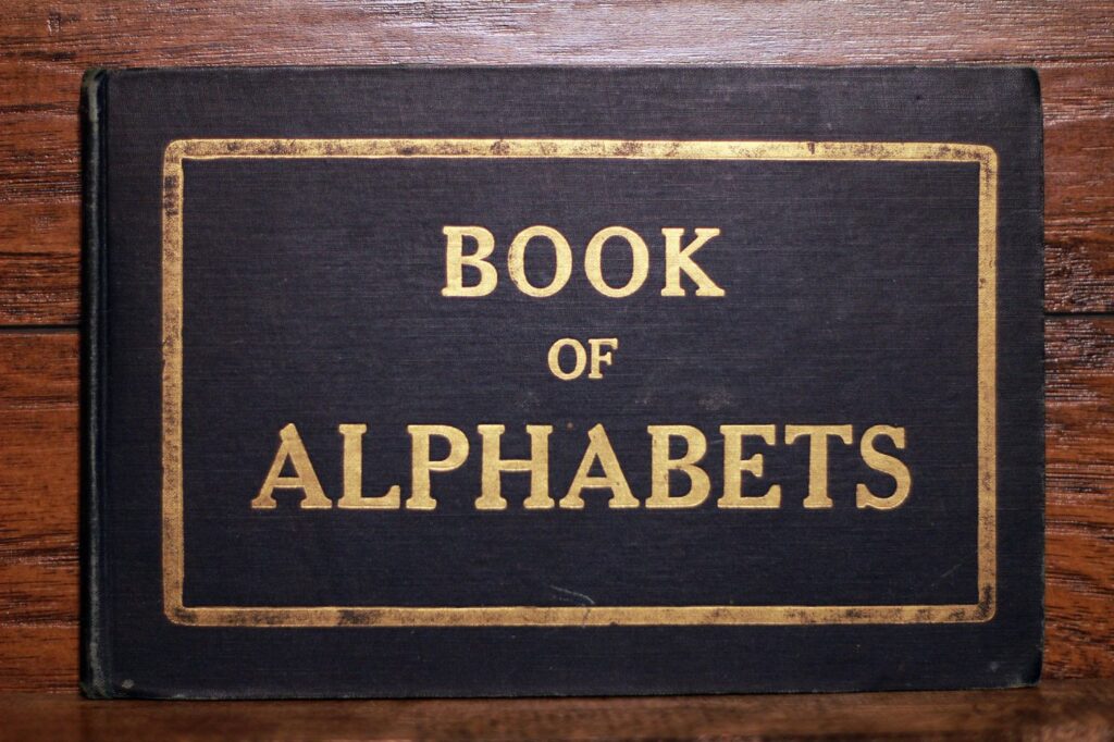
The brief for my type design course at IED Firenze was to find an old typeface and bring it back as a working font. I found mine in the Book of Alphabets, printed in Chicago in 1946 by the Charles T. Powner Co. It was sold as a reference for architects, draftsmen and students learning to letter by hand, and like most books of its kind, it never says who drew the alphabets inside.
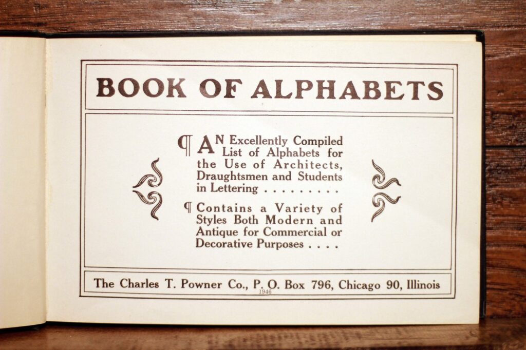
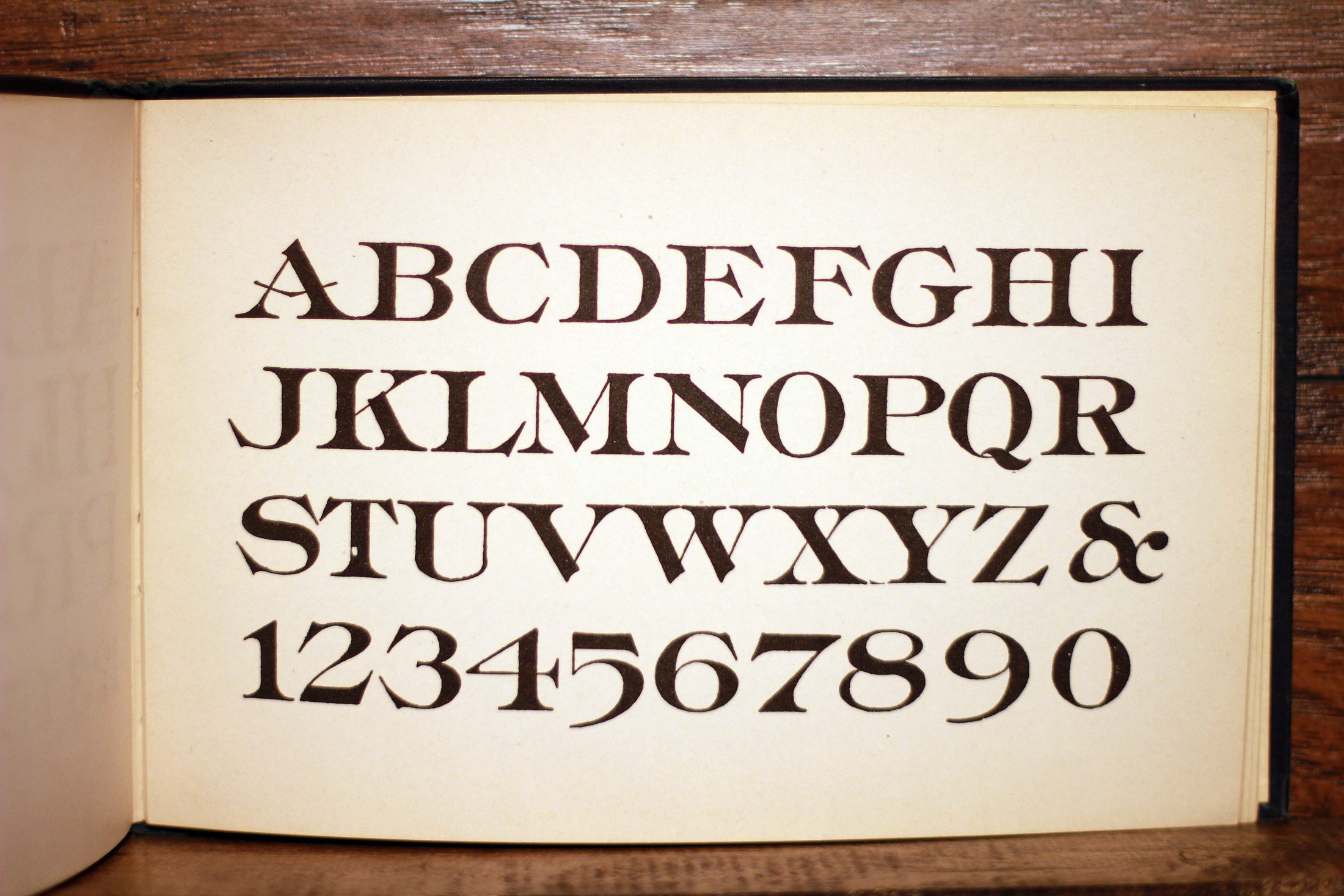
Alphabet No. 119 sits on page 52: capitals, an ampersand and ten figures, with real contrast, sharp bracketed serifs and an A whose crossbar cuts straight through both legs.
Reading the letters
Before drawing a single point I needed to know what I was looking at. On the page it reads as a transitional serif: heavy strokes against hairlines, a vertical axis, and wide bracketed serifs that sit flat on the baseline. The flavor is Elzevir, a 19th-century revival style named after a family of Dutch printers. Those traits became the rules for every glyph that followed.
- The crossbar of the A runs straight through both legs.
- Hairlines against heavy strokes, so the contrast is high.
- Wide bracketed serifs, flat on the baseline and sharp at the tips.
- A vertical axis: the thinnest points of the O sit one above the other.
- Round letters overshoot the cap height and baseline slightly, so they look the same size as the flat ones.
How it was drawn
The page is a photograph, not a clean scan, so the work started in Photoshop. I cut out every character, set them all on one baseline and one cap height, and cleaned up the ink until each edge was readable.
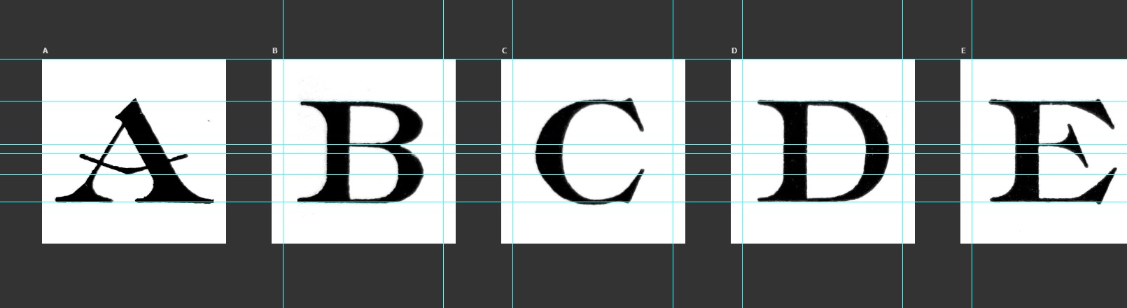
Each letter then went into Glyphs as a locked background, and I drew the outline over it by hand, point by point.
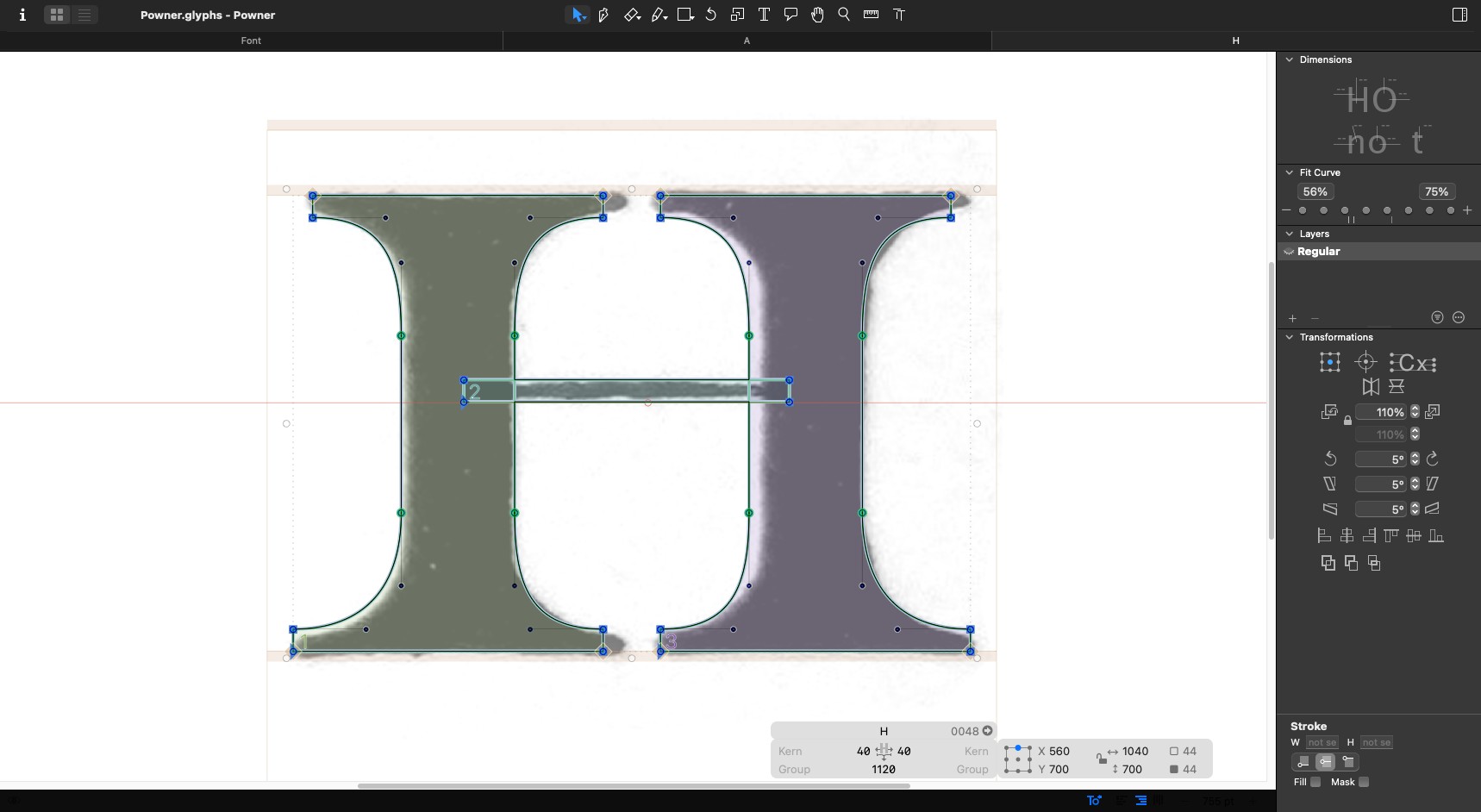
Tracing gets you close; the rest is judgment. Printed ink spreads and wobbles, so the outlines follow what the letter meant rather than every bump in the paper. The B shows it best: its bowls sit just inside the spread of the ink.
Anything that repeats was drawn once. The beaked arm on the E, F, T and Z is a single component, flipped and reused, so it’s identical everywhere it appears. The Q is the O with a tail added.
The typeface
POWNER
Named after the publisher, with the word power hiding inside.
Charles T. Powner started out as a schoolteacher and became a bookseller, with shops in Chicago, Cleveland and Los Angeles. His name was on the title page, so it went on the font.
Full character set · 26 capitals, 10 figures, ampersand, period and comma
Live type · click any line and write your own
In use
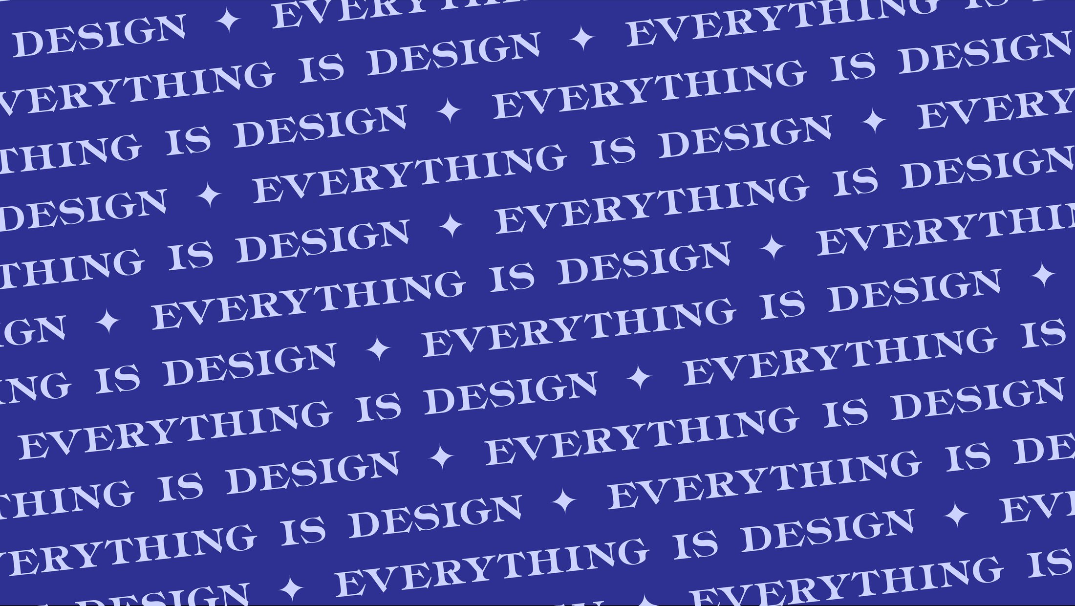
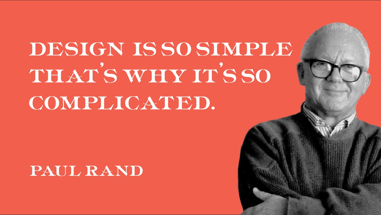
A display face earns its keep at size, so the first applications were two posters built on Paul Rand quotes: one as a repeating pattern, one set large against a single color.
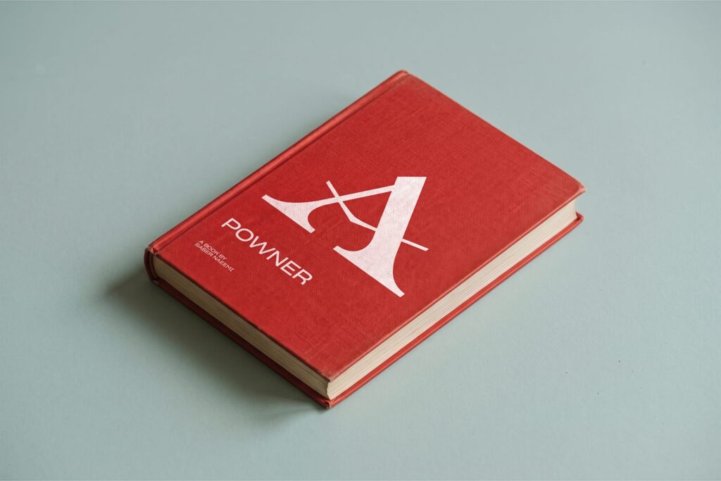
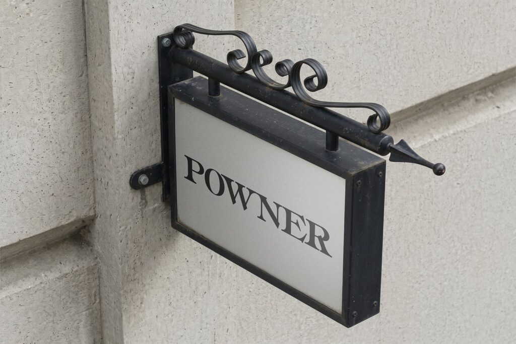
Charles T. Powner sold books for a living, so the later mockups put the font back in a bookshop: in the window, on the sign outside and on a cover.

What’s next
A working font, with room to grow.
Powner Regular installs and types like any other font. The specimens on this page are the font itself, running in your browser, not pictures of it.
It’s a first version, and I know where it goes next: proper spacing and kerning, the punctuation it’s still missing, and eventually a lowercase.
Need a wordmark that’s drawn, not typed?
Brand identity, lettering, campaigns and motion. Based in Florence, working wherever the brief is.