

Three Absolut ads where a crowd draws the bottle, answering a brief of two words: ABSOLUT SOCIAL.
- Brand
- Absolut
- School
- IED Firenze
- Advisor
- Prof. Enrica Ficai Veltroni
- Year
- 2022
- Format
- A4 print, vertical
- Status
- Campaign concept
- Deliverables
- Three A4 print ads · shop window poster and street triptych mockups
- Tools
- Adobe Photoshop
The brief
The headline is the brief.
Absolut’s print campaign began in the United States in 1980 and ran to more than 1,500 ads, one of the longest runs in advertising. Each one is built the same way: the bottle, or its shape, over two words. An island shaped like the bottle, a swimming pool, pigeons in a square in Venice. The silhouette is famous enough to sell without a label.
The brief borrowed that format and kept it strict. One vertical page, with the headline ABSOLUT SOCIAL. fixed at the base. Everything else had to come from the image.
- One vertical A4 page, 210 × 297 mm. No other sizes, no spreads.
- The visual: the only place left for an idea.
- The headline at the base, set in Futura Extra Bold Condensed, the brand’s own lettering.
- The full stop. Every Absolut headline ends on one.
The word
Social is something people do together.
Before any image, the word itself. Social is contact and exchange between people: belonging, support, getting further together than alone. It breaks down into six ideas.
Relationships
Forming connections, bonds and friendships.
Communication
Talking, sharing ideas, working things out together.
Community
Belonging to a group with shared interests or goals.
Engagement
Taking part in events and activities with others.
Teamwork
Working with others toward a common goal.
Entertaining
Having fun together: parties, clubs, concerts.
Six ideas behind one word
Every one of them takes more than one person. So the ads would show no product at all, only people, and let the bottle appear in the way they come together.
The bottle is never shown. People draw it.
No glass, no pour, no product shot · only a crowd and the shape it makes
The ads
One bottle, three ways to gather.
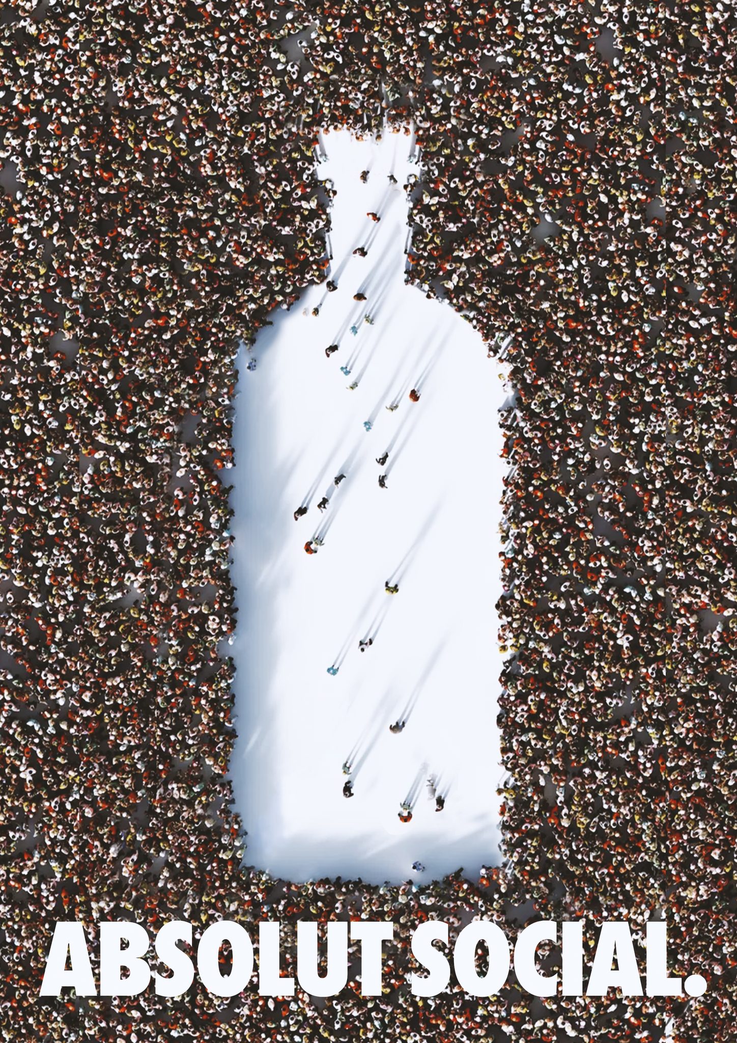
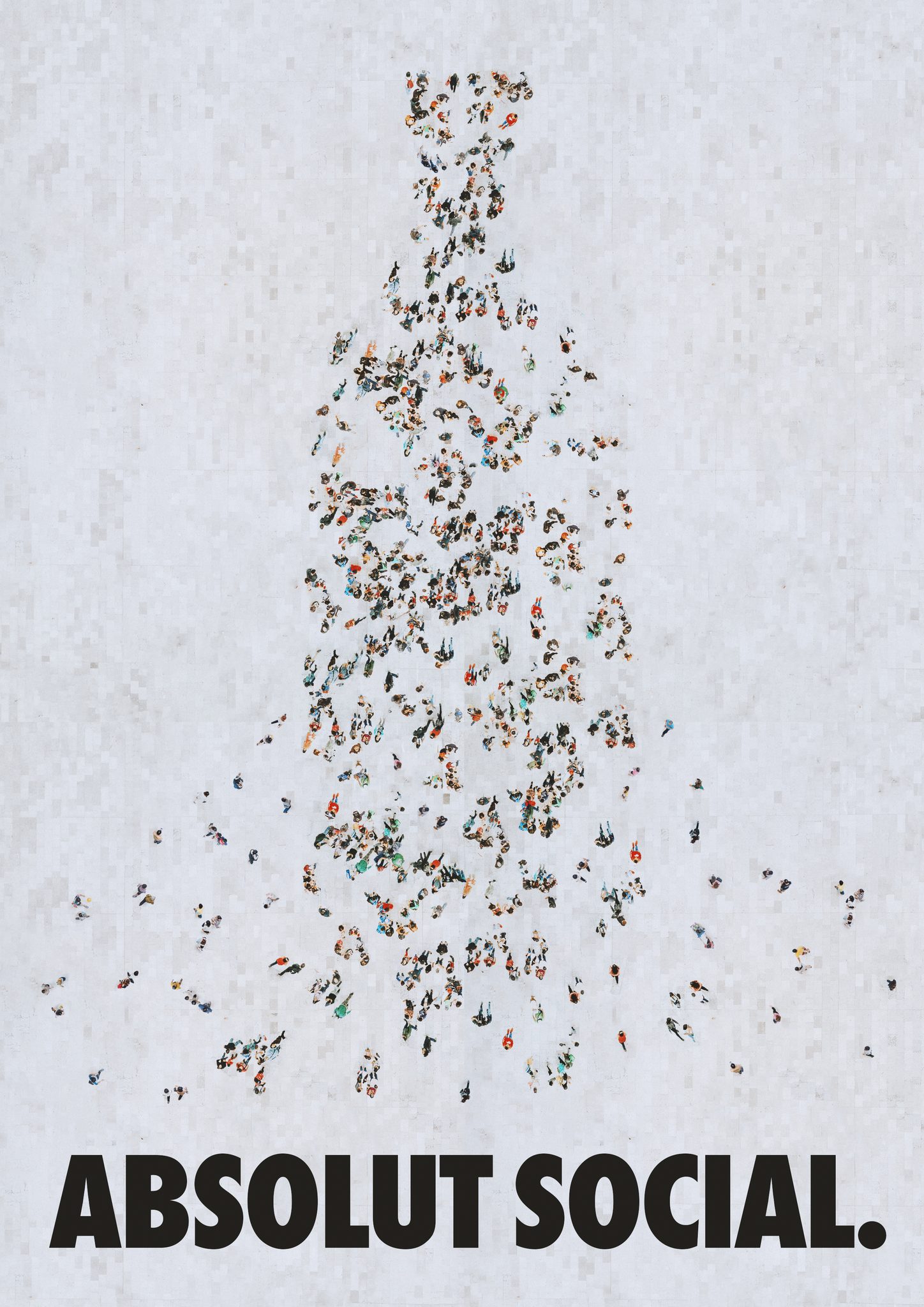
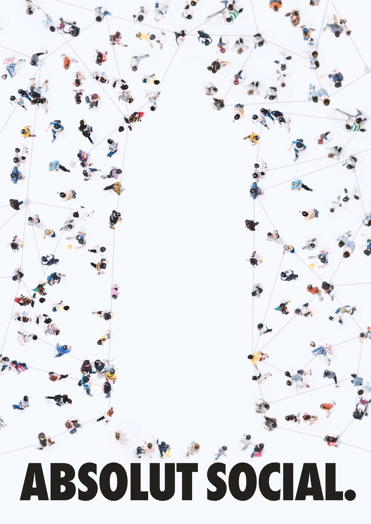
All three look down on a crowd, and each finds the bottle differently. In the first, a packed square opens up and the clearing is the bottle, with a few people still walking in. In the second, people meet on a plaza and become the bottle themselves, more still arriving at its base. In the third, a looser crowd is joined by thin lines, person to person, around an open space.

Up close
A crowd as mixed as a city.
Every age and background, people alone, in pairs and in small groups, a few friends around a wheelchair. The product never appears among them. Absolut is simply the reason they are in one place.
The lines in the third ad give social its other meaning: the network. They join person to person across the page, and along the open space they run straight, drawing the edge of the bottle.

On the street
Three ads, one series.
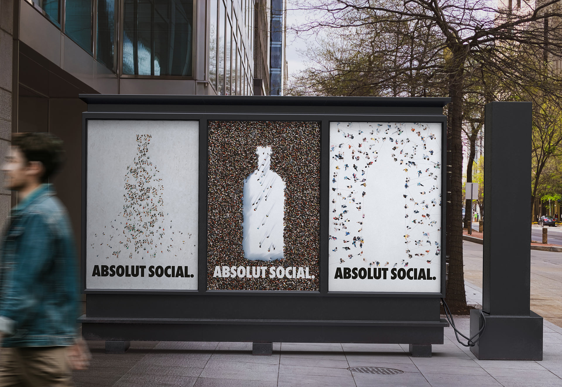
On a street triptych the three run side by side and read as a series, the way Absolut ads always have: the same two words, the same bottle, found a new way every time.
Need an idea that makes people pause and take notice?
Brand identity, campaigns and motion. Designer based in Florence, working wherever the brief is.